

Brand & Product · Principal Designer
I don't wait for clarity. I shape it.
I specialize in 0→1 brand and product work for consumer entertainment. From blank canvas to launch, and the systems that hold it all together after.

Let's work together

Branding • Web App • Entertainment
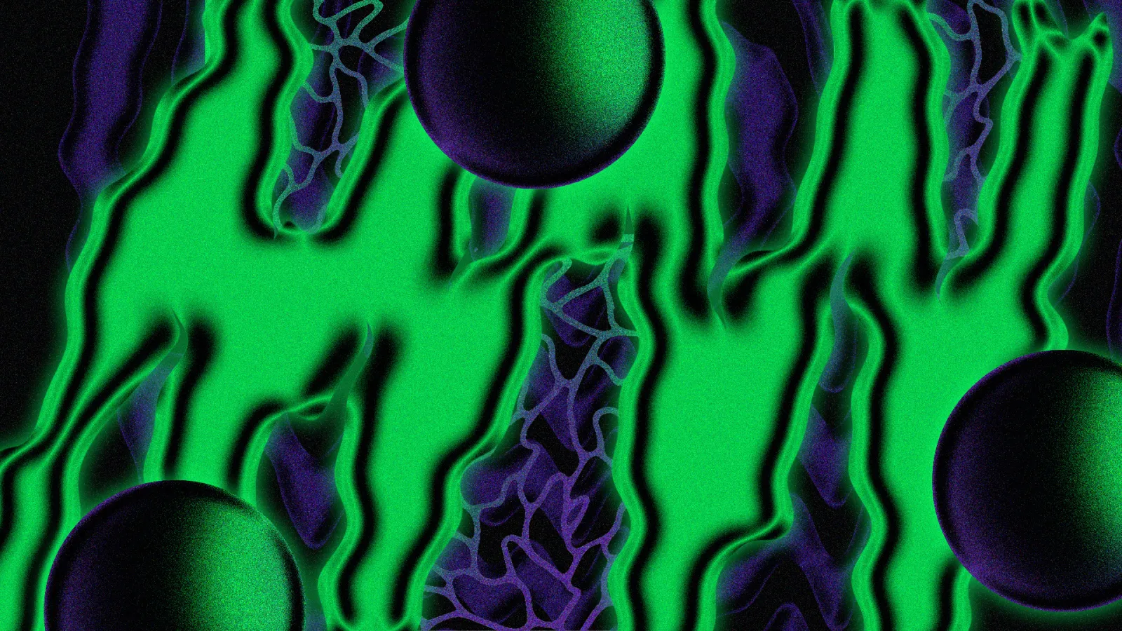
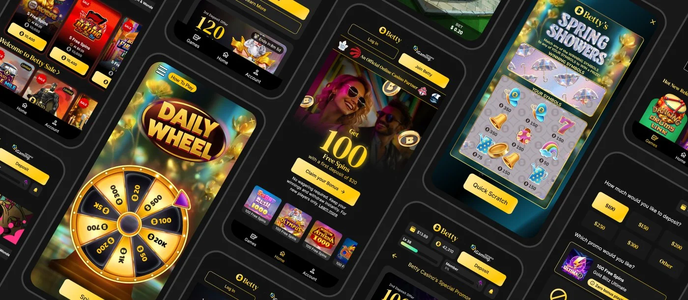
Building Ontario's #1 online casino brand from a whiteboard
No brand. No product. No system. Fewer than 20 people. That was Betty when I joined in 2022. Today it's Ontario's most recognized online casino, with 300+ team members and a design language that scales from app screens to out-of-home.
Ontario regulated online gambling in April 2022. Betty launched ten months later.
The Ontario government's decision to open its online gambling market created a rare window: a multi-billion dollar industry, a clean slate, and a hard deadline. I joined the founding team that same month, before there was a product, a visual language, or a component library. Just a name, a domain, and a mandate to build something that could compete on day one.
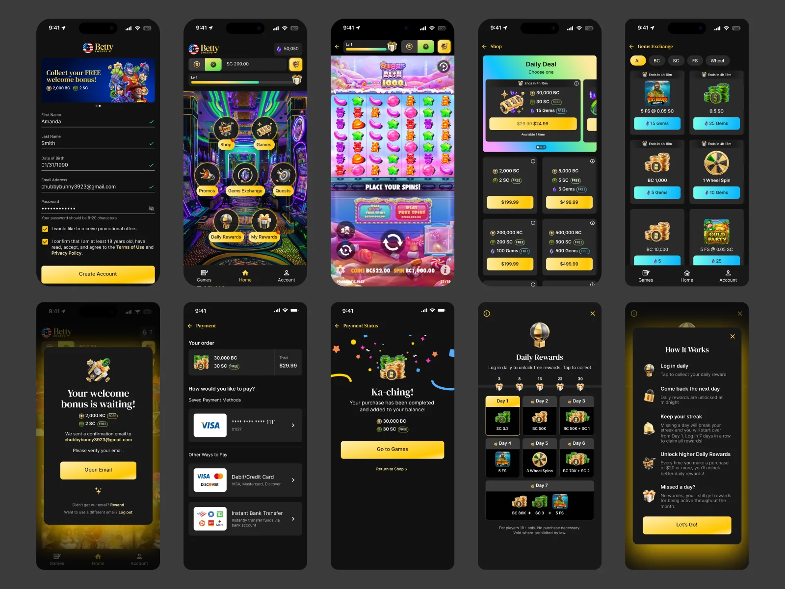
Betty's founding bet was deliberate: the first brand to feel modern, trustworthy, and Canadian would own the market. My job was to make that real: brand, product, and system, in time for a February 2023 launch.
Designing a brand that could hold up at broadcast scale from day one
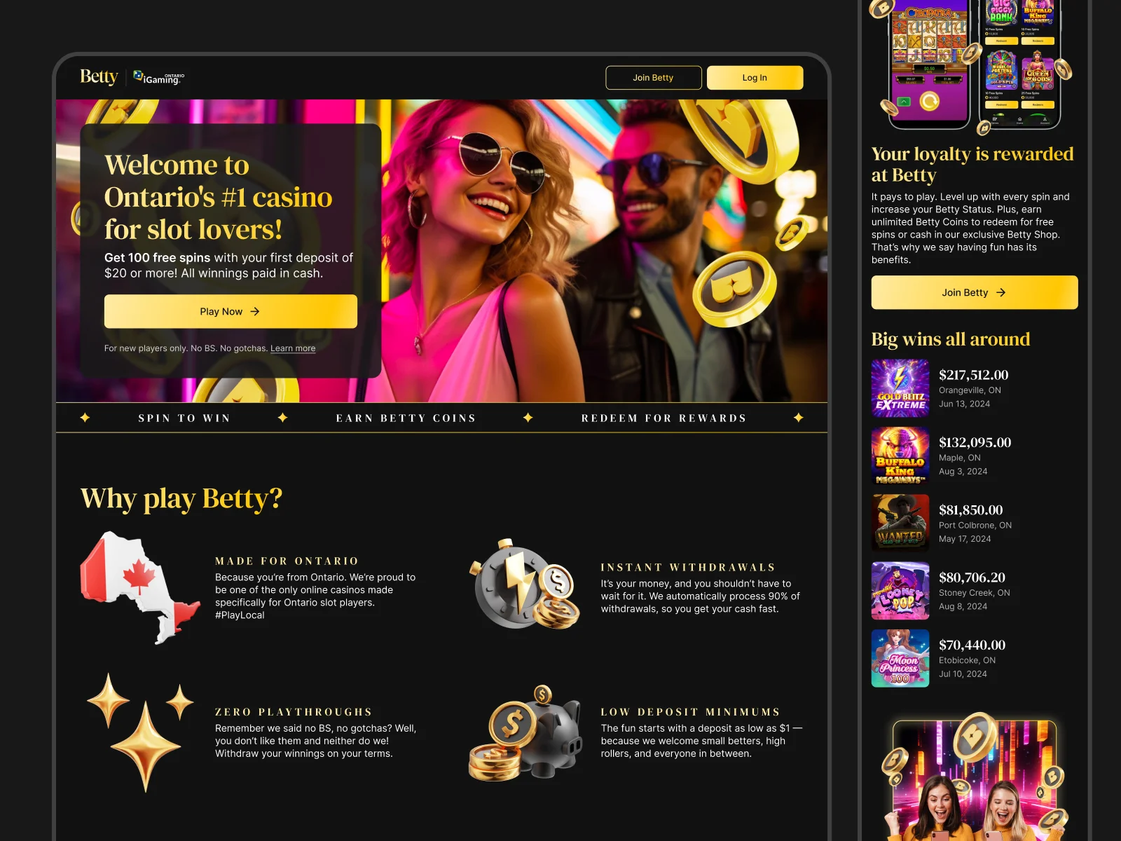
Online gambling brands tend toward one of two failure modes: garish and aggressive, or so "premium" they feel cold. Betty needed to be warm, a little irreverent, and immediately trustworthy. It was designed for a Canadian audience that was new to legal online gambling and skeptical of it.
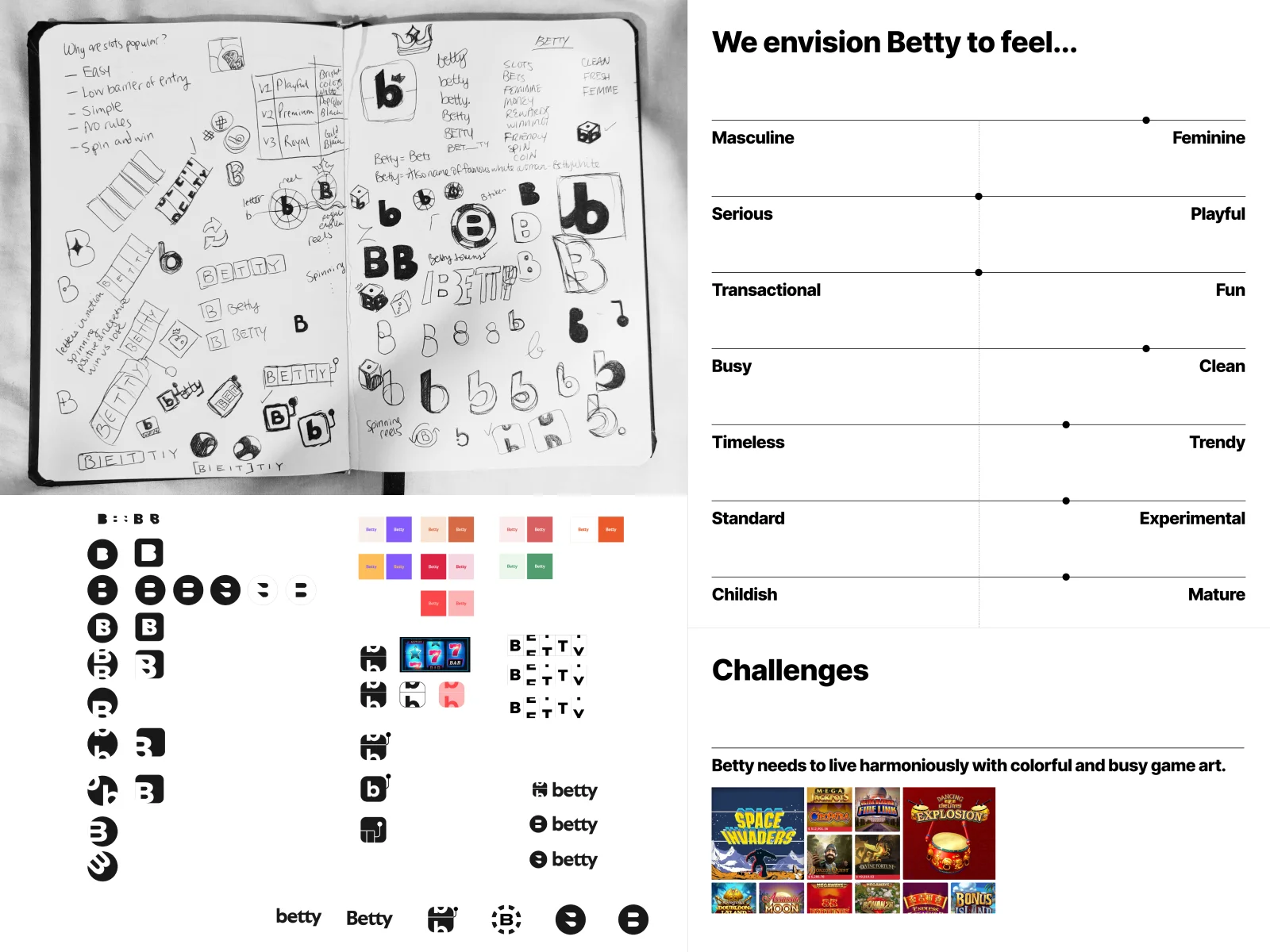
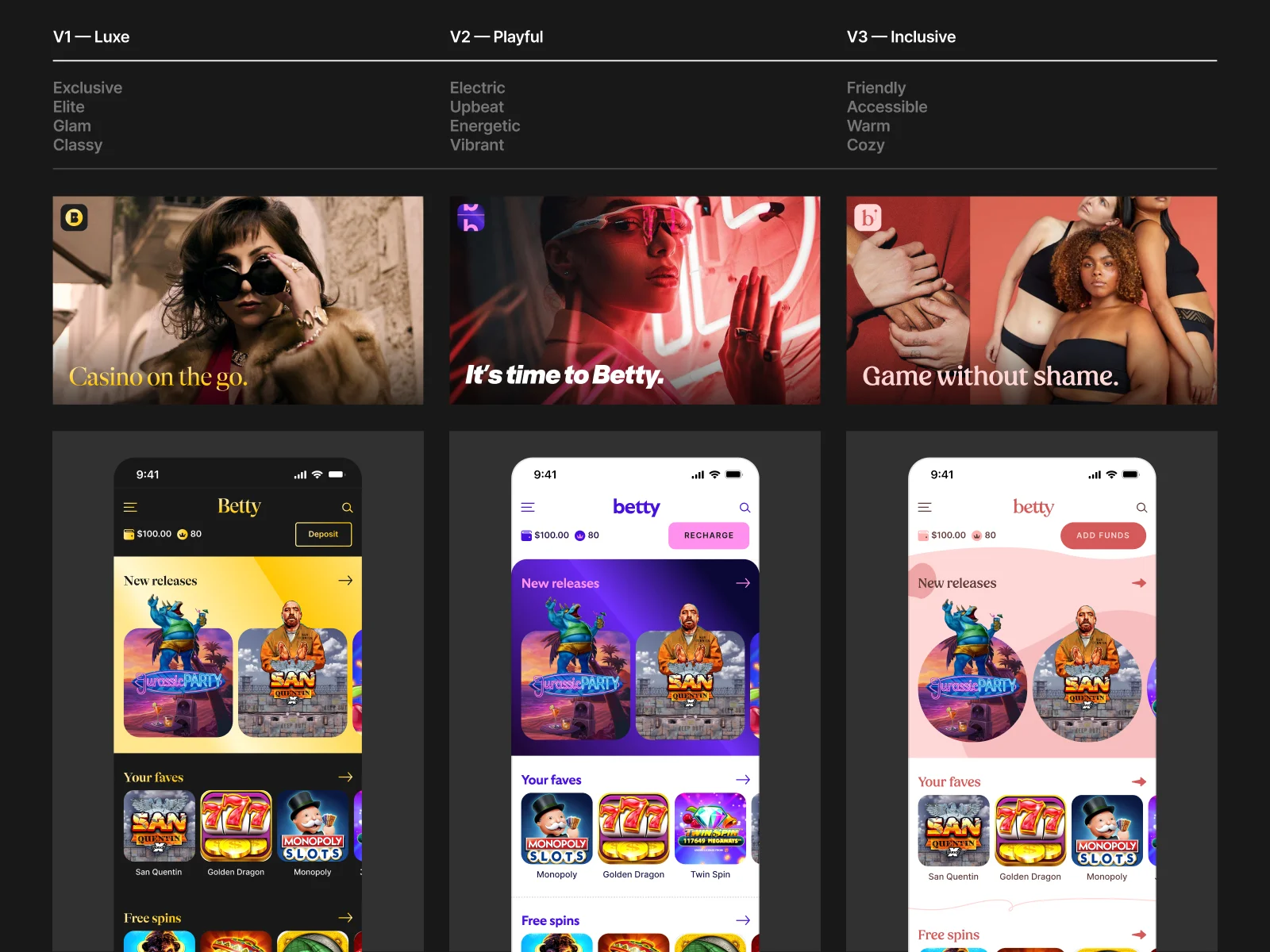
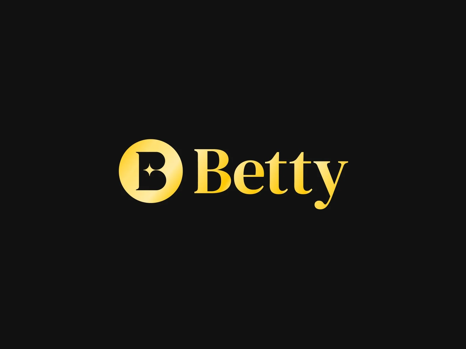
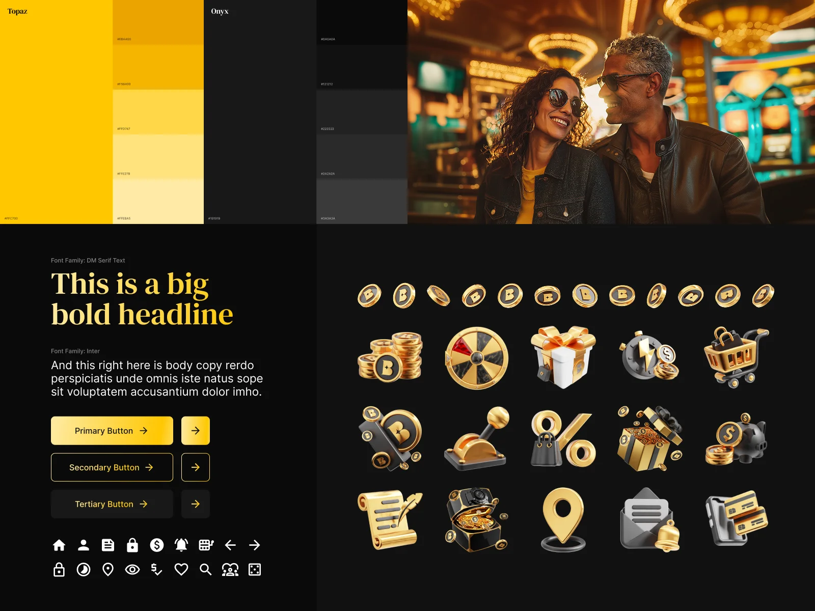
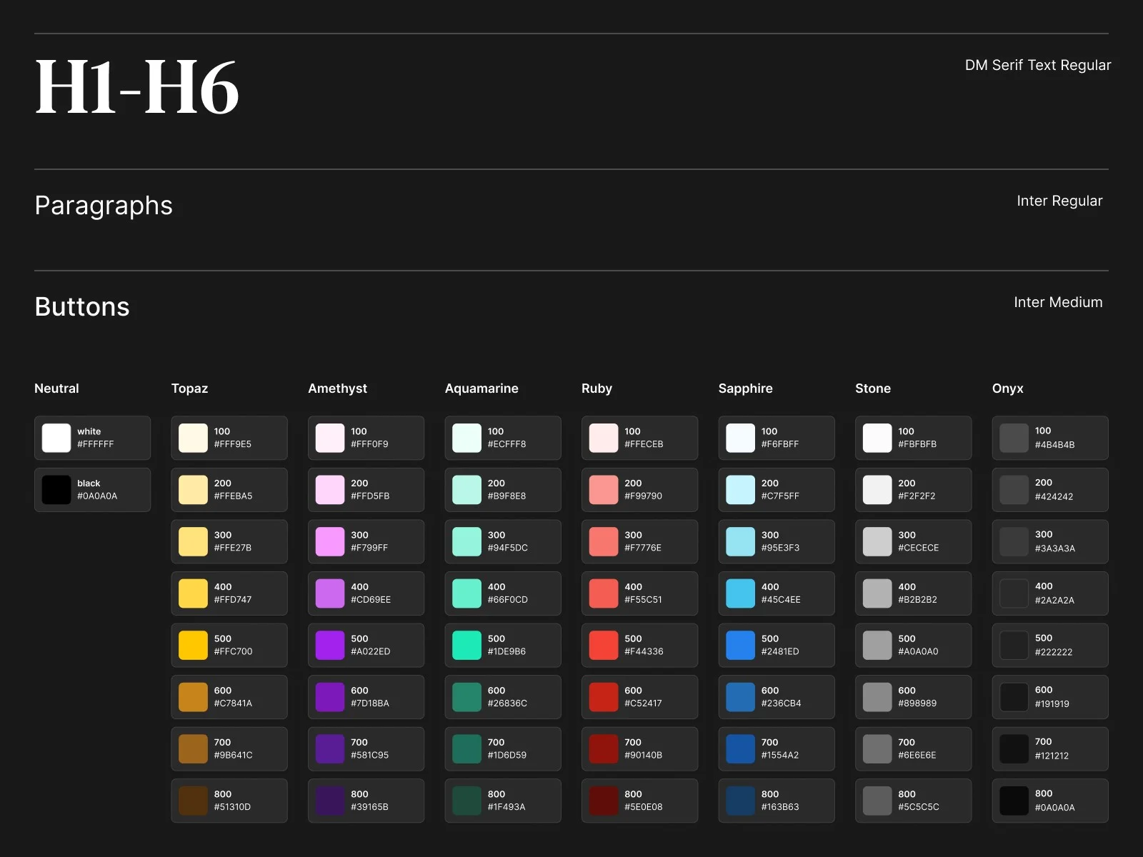
I designed the logo, established the color palette, selected the type system, and built the iconography language. Every decision was made with scalability in mind: this identity needed to live on a web app, in performance marketing, on TV, and eventually across new markets.
"The brand had to earn trust in a category that had spent decades doing the opposite. Betty needed to be friendly enough to feel approachable, and restrained enough to feel trustworthy."
Shipping a go-to-market product as the only designer in the building
As the sole designer for the first two years, I was designing the lobby, the game experience, onboarding, account management, promotions, responsible gambling flows, and the marketing site. Simultaneously. I built a component library as I went so future designers could extend rather than reinvent.
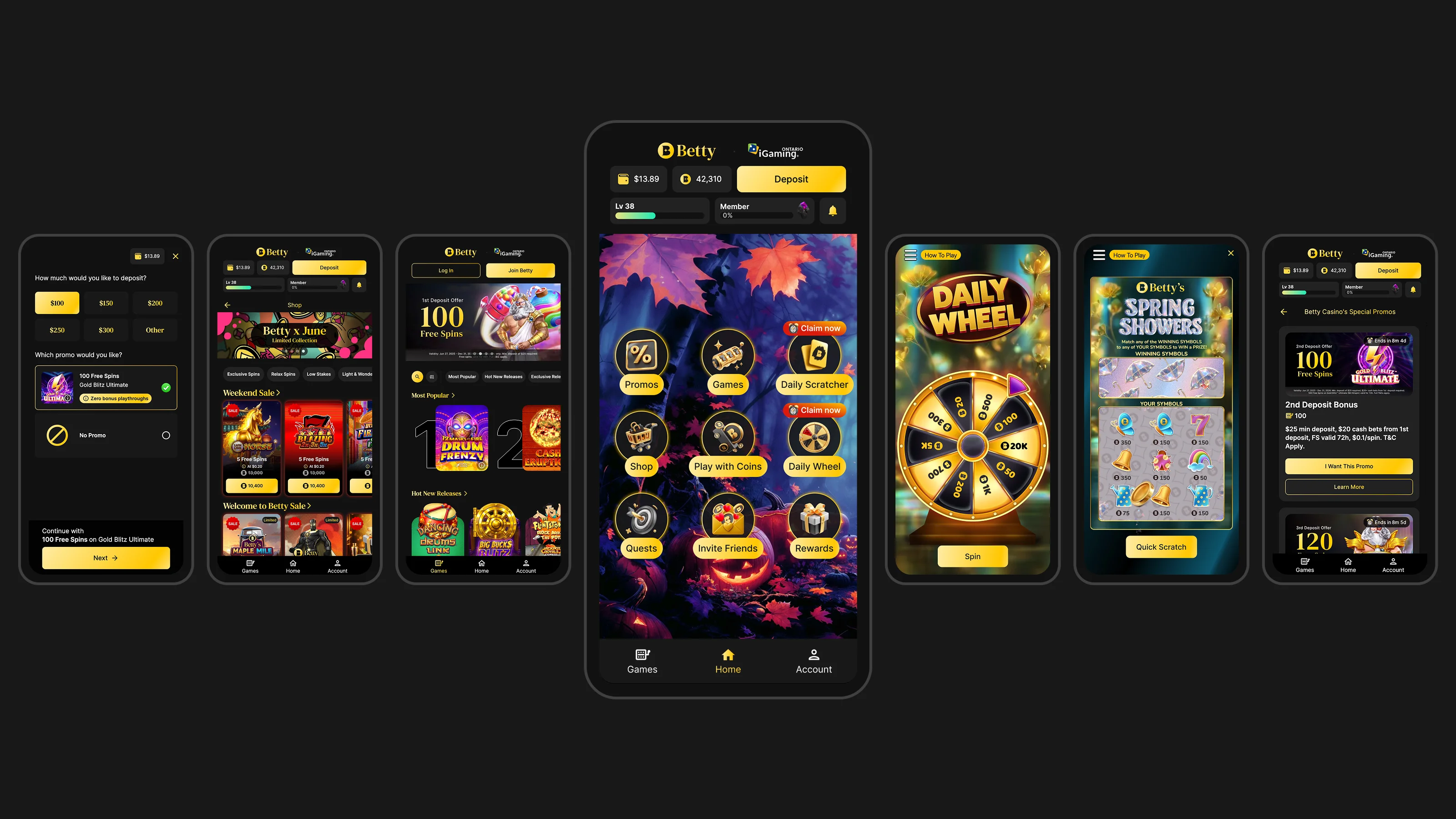
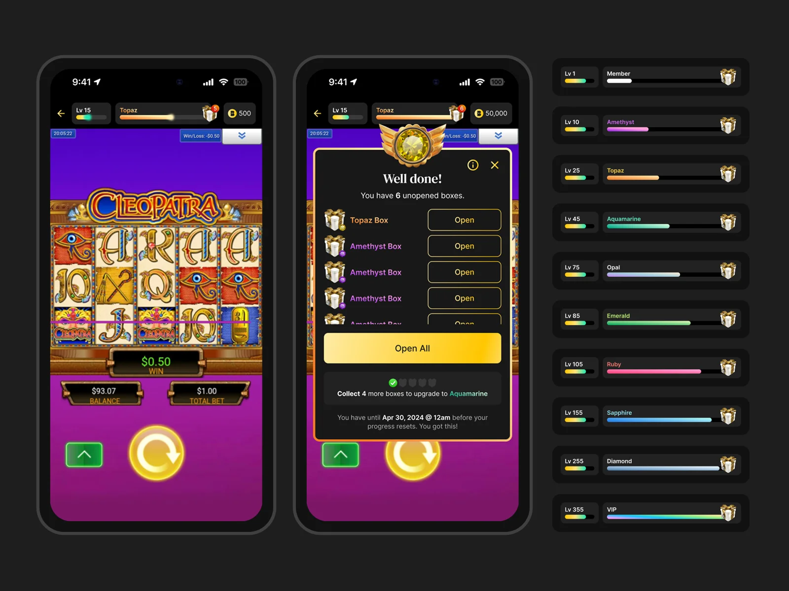
Betty launched in February 2023. It held together because the design language was clear enough to give the engineering team a foundation they could build on fast, without the product drifting into inconsistency. The original design system is still in use today.
Testing the bets before and after they shipped
Even with a hard deadline, the big bets still got tested. I partnered closely with our User Research Lead on surveys and one-on-one interviews, before and after launch, to pressure-test both the brand and the product with the audience they were built for: Canadians new to legal online gambling and wary of it. I brought the design questions that needed answering and turned what we heard back into the brand and the key flows.
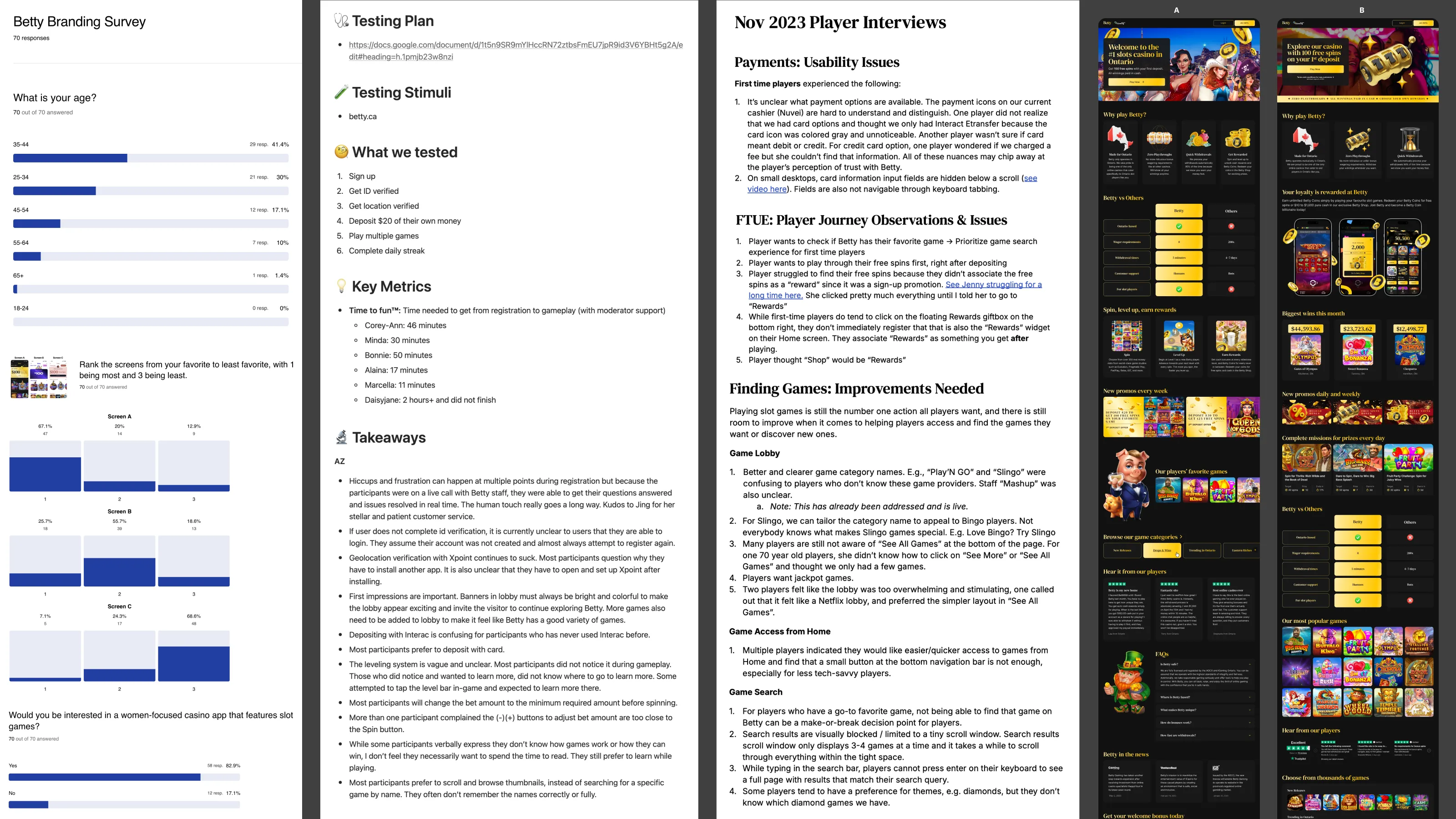
On the quantitative side, I worked with our User Acquisition Lead on extensive A/B testing across the marketing and landing page experiences, primarily welcome offers and hero content, where small shifts in framing and messaging moved real conversion. I designed the variants and helped shape what we tested; the acquisition team ran them.
Building the design team and expanding to new markets
As Betty grew, my role shifted from sole contributor to design lead. I defined hiring criteria, onboarded new designers, and established critique culture and design process from scratch. The design system I'd built alone now needed to be legible to a team, which meant formalizing what had previously lived only in Figma and my own head.
The expansion work took Betty's brand and product into new markets beyond Ontario by adapting the core system for jurisdictions with different regulatory requirements, different content rules, and different player expectations, while keeping the identity coherent.
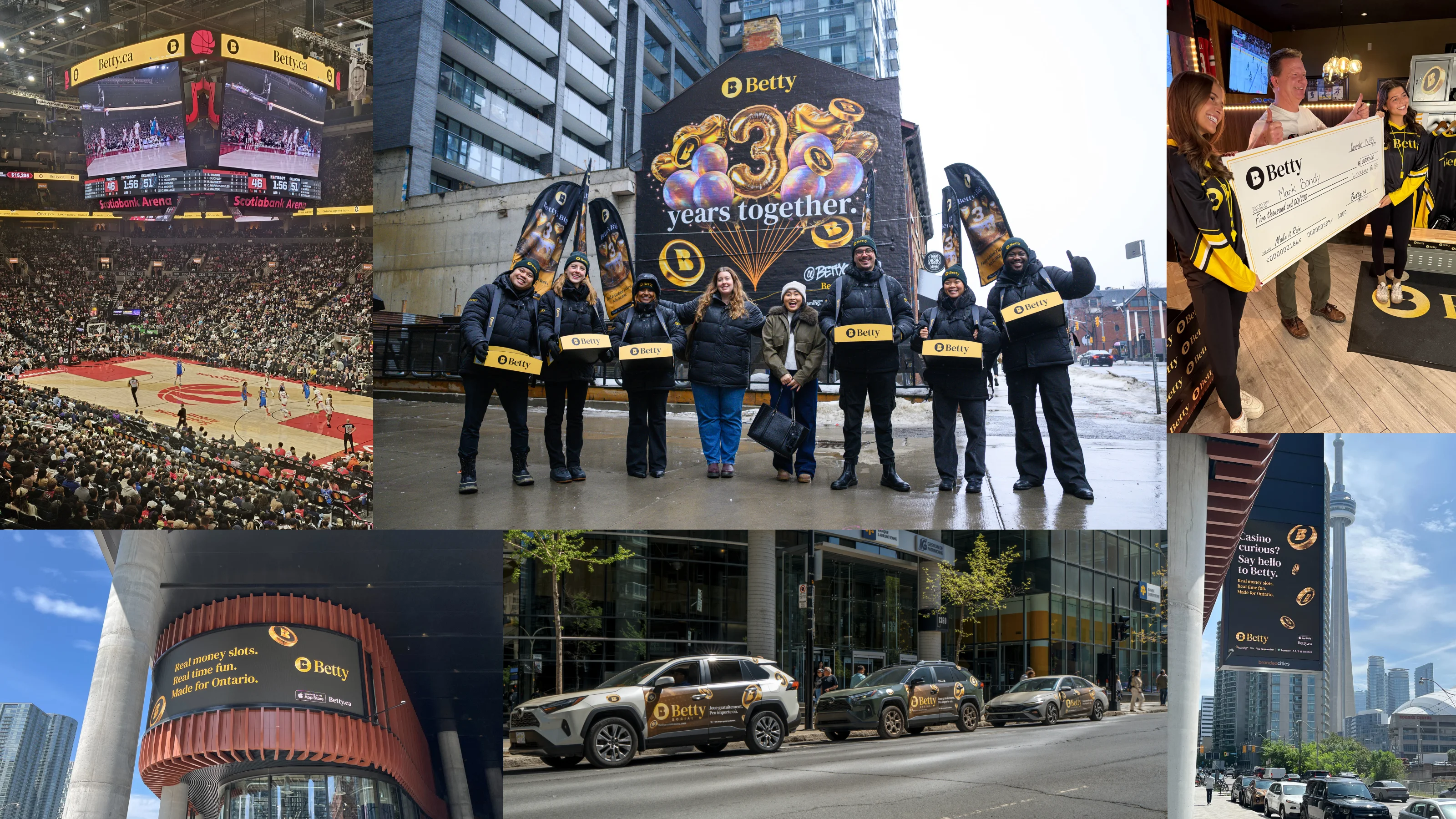
Betty became the benchmark for what a modern Ontario casino brand looks like. The design foundations I established held up through explosive growth: new feature development, new markets, new teams, and new leadership. The brand that started on a whiteboard is now the first casino Ontarians think of, and the official casino partner of every major Toronto sports franchise.
Move fast, but make speed accountable
The hardest part of 0→1 in a regulated industry isn't the design; it's knowing which corners you can cut and which ones will cost you later. Moving fast was non-negotiable, so the discipline had to come from somewhere else: surveys and interviews to test the brand and product with real players, and A/B testing on acquisition to prove out the messaging that instinct alone couldn't settle. That's what kept speed from turning into guesswork.
Where I got the calibration wrong was the design system documentation. It worked while I was the only designer and became a bottleneck the moment I wasn't. The bigger lesson was about transitioning from maker to leader: moving fast, holding the full system in my head, and making calls without consensus were the same instincts I had to unlearn when the team scaled. I'd make that handoff more deliberately next time.
Let's work together
Branding • Mobile App • Entertainment
Designing a social entertainment app where telecom meets media
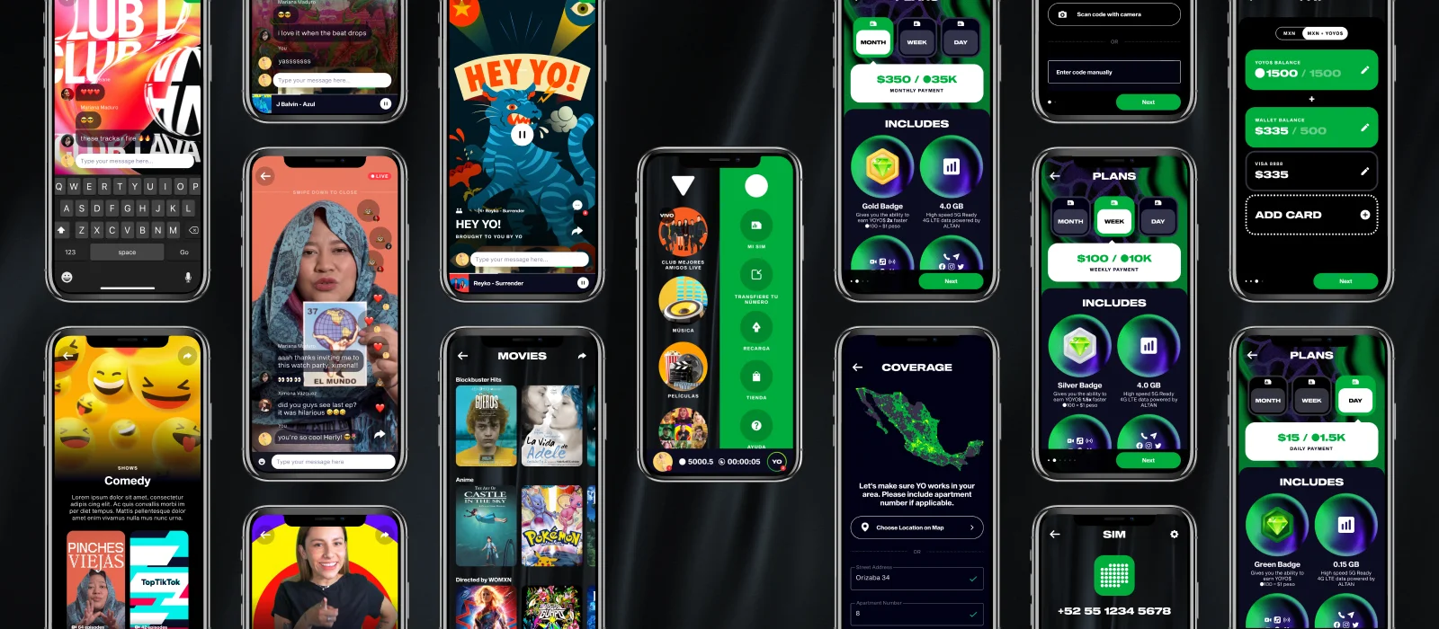
YO Mobile started with a question almost no one was asking: What if your mobile carrier was also your entertainment platform? Movie watch parties, music streaming, and a rewards currency that turned screen time into free data. All from a company of five people. I was Head of Design.
A founding team of five, building something with no direct blueprint
YO Mobile's premise was unusual: a mobile carrier that embedded entertainment natively into the experience. MVNOs held less than 2% of Mexico's mobile market at launch, with over 20 competitors entering in 2020 alone. The only way to stand out was a product that no one else could copy quickly. Previous attempts, like Virgin Mobile Mexico, had tried bundling third-party streaming services. YO's bet was different: build the entertainment layer from scratch, own it entirely, and make it the reason people chose the carrier.
I joined as an early employee working directly with the CEO, COO, CPO, and CTO, defining what the product actually was before a single screen was designed. My role was Head of Design from day one: building the brand, designing the product, and eventually leading a team of three UI and UX designers as the company grew.
Steering design direction through constant product leadership turnover
YO Mobile went through significant turbulence. Product owners joined and left every 6 to 12 months. During that time, the design team became an anchor of continuity. I maintained a clear design vision and protected product coherence through multiple CPO transitions, building enough shared documentation and design rationale that new stakeholders could orient quickly without resetting everything.
"When the product org is in flux, design becomes the institutional memory."
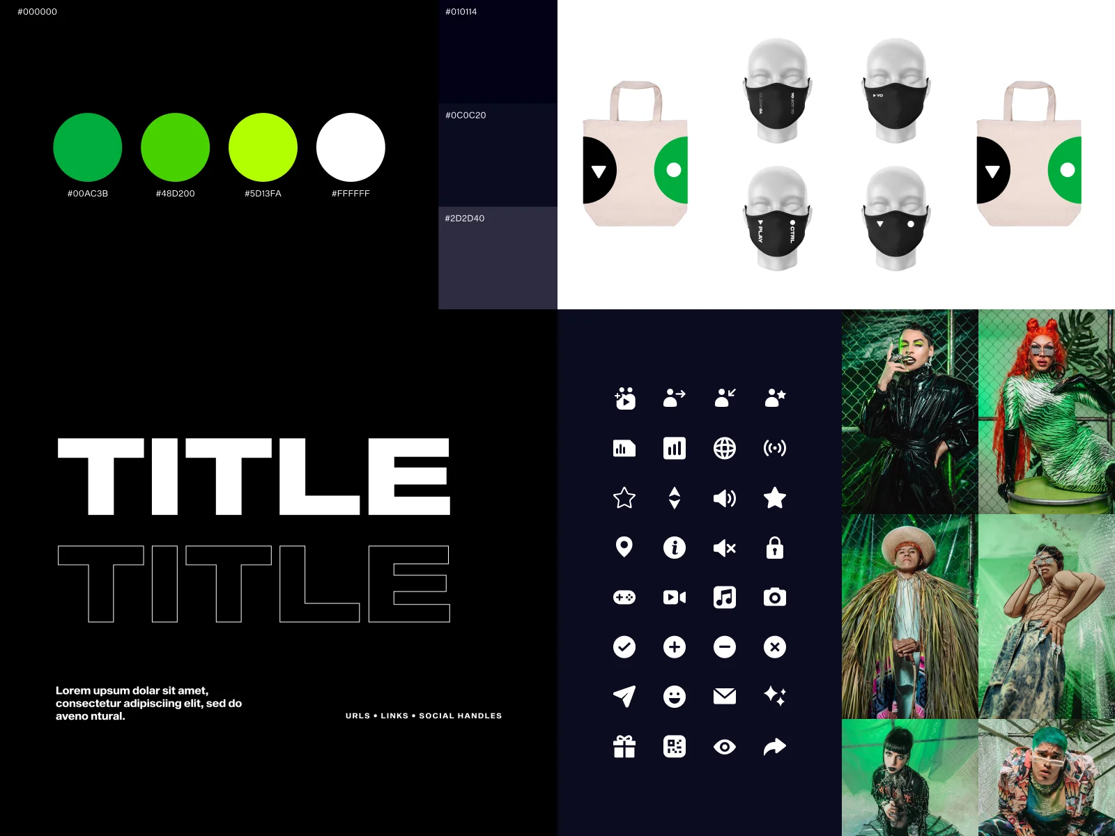
Building a visual identity with no reference points
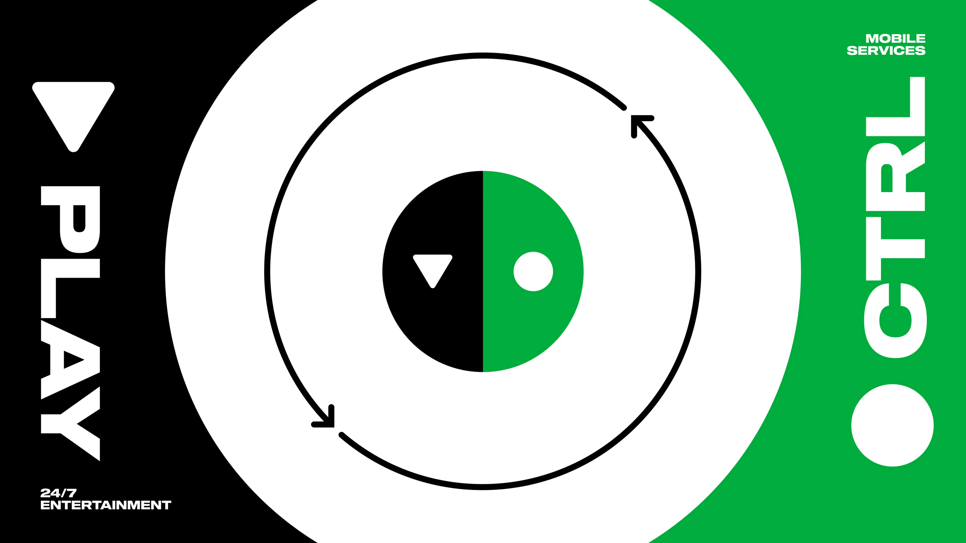
There was no existing brand to inherit. YO Mobile needed a visual identity built from scratch: one that could appeal to a young Mexican audience, feel at home in an entertainment context, and still carry the credibility of a legitimate carrier. The name itself set the tone: short, punchy, bilingual by nature. The design had to match that energy.
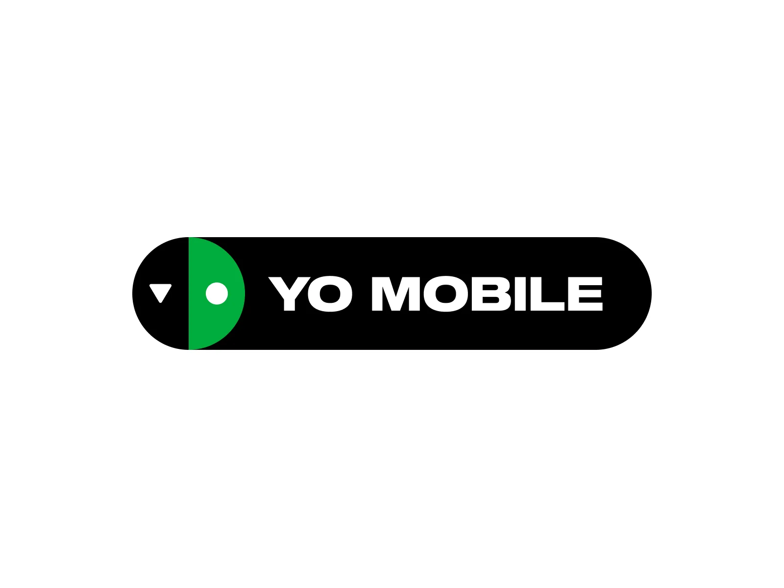
The logo concept came from Nintendo Switch controllers: two distinct halves that only make sense together. PLAY on the left for entertainment, CTRL on the right for mobile services. The brand needed to live in both worlds without feeling like a compromise between them, and the mark made that argument visually before a word was read.
The mechanic that made everything else make sense
Every feature in the YO app fed into a single reward loop: YOYO$. Users earned 0.1 YOYO$ for every second spent in the app, whether watching a movie with friends, tuning into a live DJ set, or listening to a curated radio station. Those credits could be redeemed directly for SIM purchases and data top-ups, turning entertainment time into tangible utility.
This closed the loop between the two halves of the product that would otherwise feel unrelated. The telecom layer was the payoff, not a billing portal bolted onto an entertainment app. Designing YOYO$ meant creating a currency system with clear visual language, redemption flows, and balance states that had to feel rewarding without feeling like a casino mechanic. The balance between aspirational and trustworthy was a constant design tension throughout.
Designing across three different feature domains under one coherent identity
The product had an unusually wide surface: telecom management, social features, and media consumption. Three paradigms that typically live in three different apps. The design challenge was finding a visual and interaction language that could hold all of them together without feeling like three products duct-taped into one. The answer was a strong, opinionated brand layer that sat above the feature domains: shared type, color, motion, and component behavior that created continuity regardless of what surface you were on.
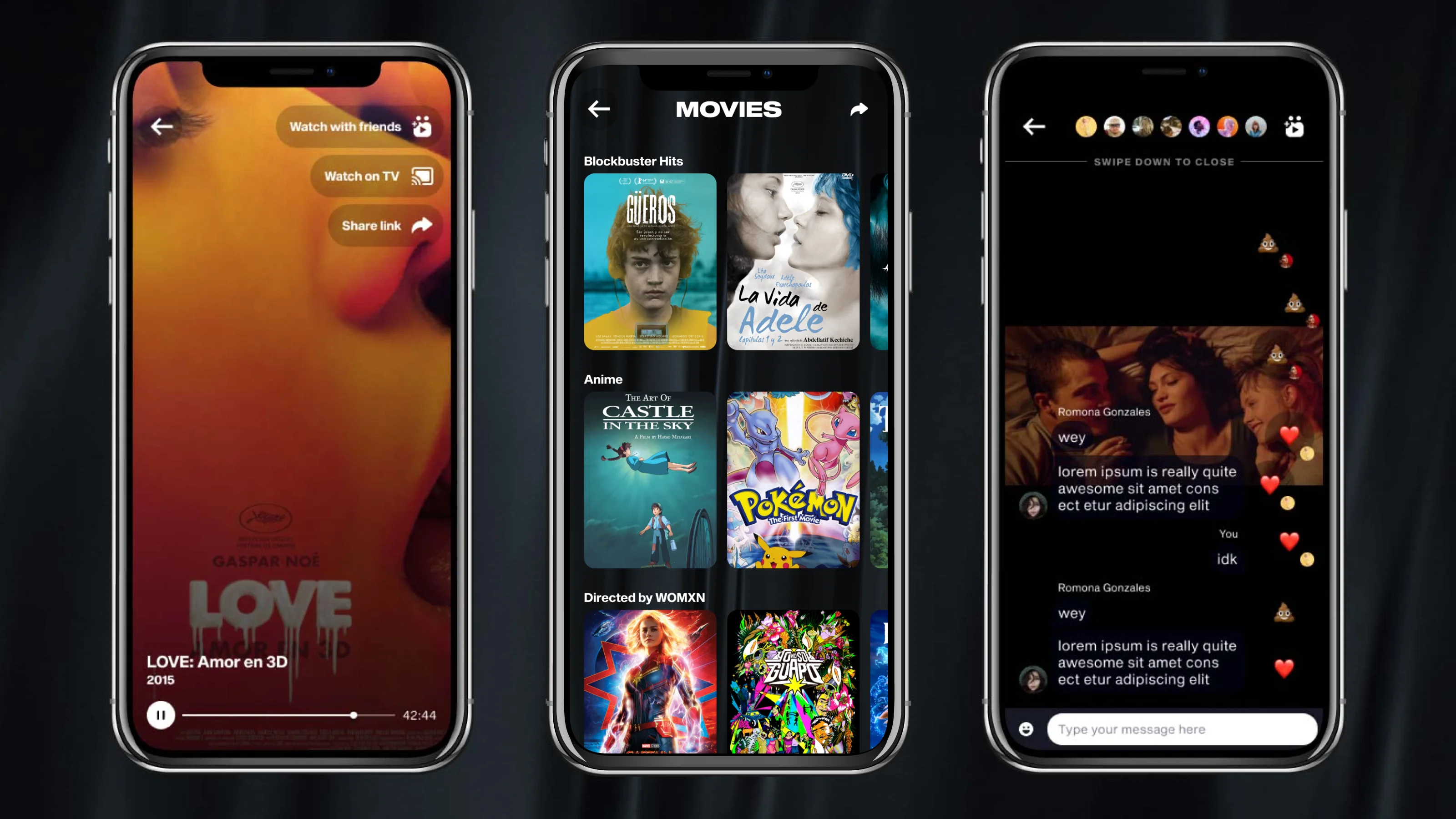
Watch parties let users invite friends to watch movies together in real time, with synchronized playback and a live chat rail. The key design challenge was making a technically complex, multi-user experience feel effortless to initiate. Latency and sync required close collaboration with engineering, but the goal from a design perspective was to make the feature feel as casual as texting a friend.
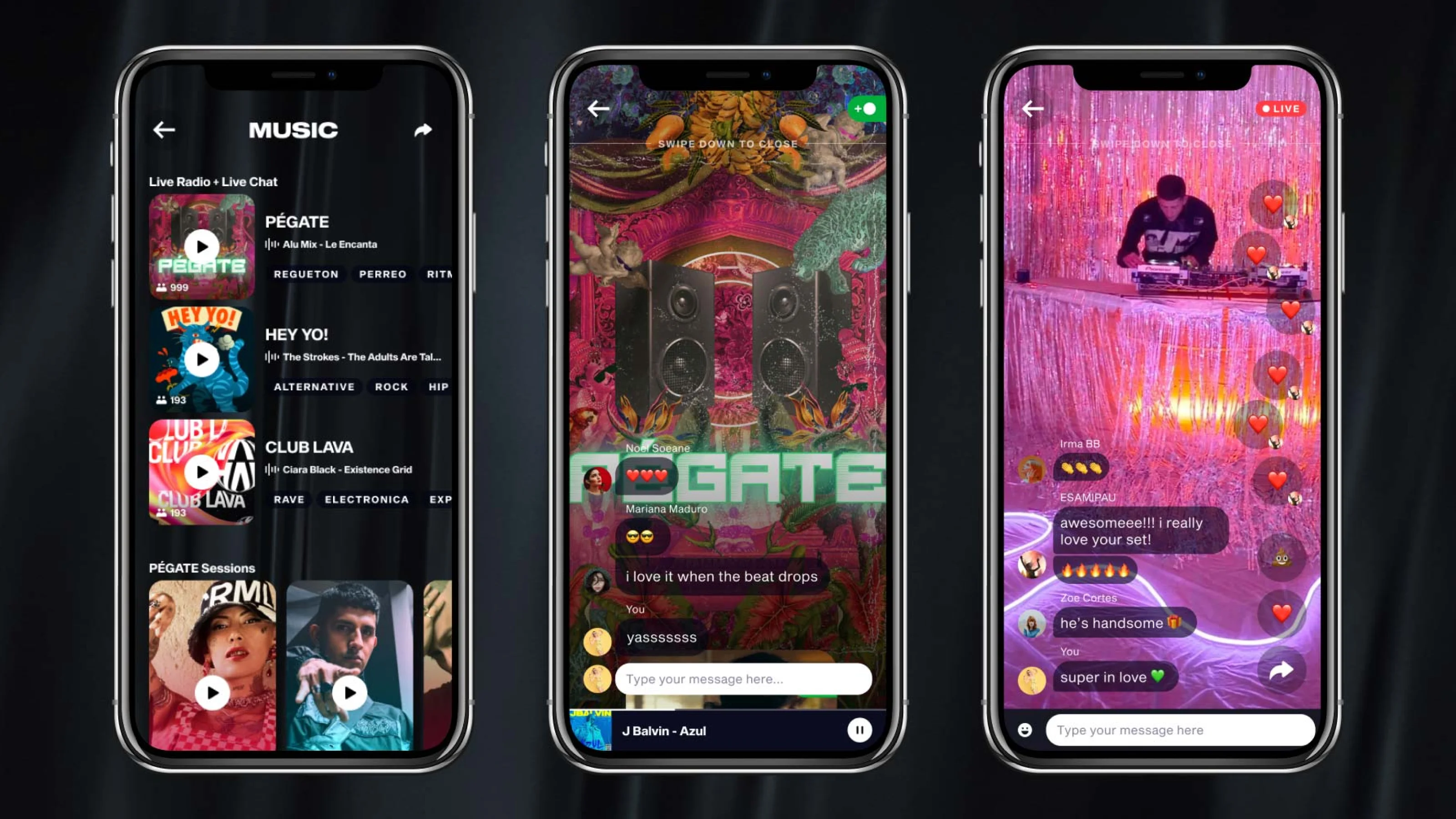
YO Mobile had an in-house content team in Mexico City that partnered with local artists to stream live DJ sets directly into the app. Users could tune in, listen live, and interact through a shared chat rail. Alongside live streams, the app also offered curated radio stations: premade playlists produced by local DJs, giving users a passive listening option between live events. The music feature gave YO a cultural identity that no other carrier in Mexico could claim.
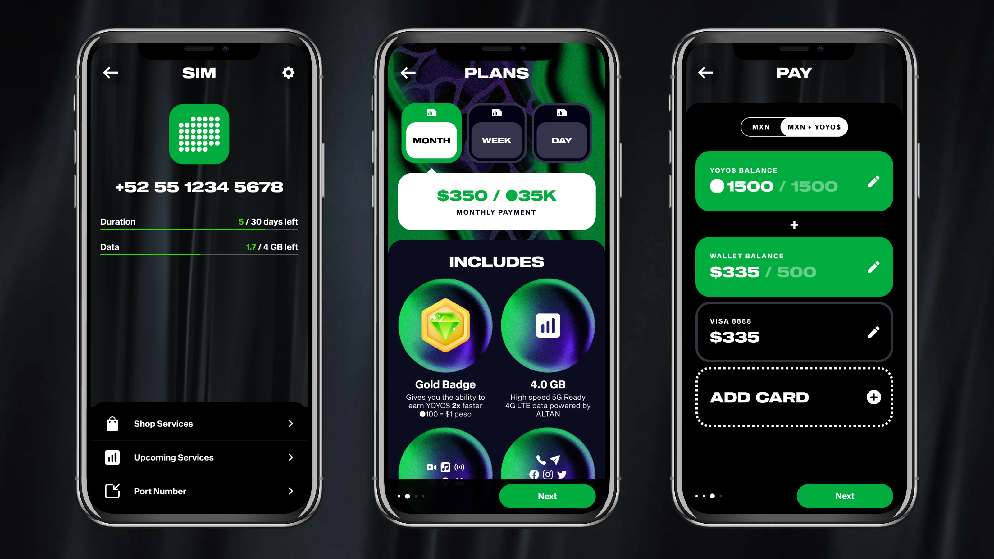
The telecom layer was the least glamorous part of the product but arguably the most important: SIM purchases, data top-ups, plan upgrades, and account management all had to live inside the same app as watch parties and live music. The design challenge was making utilitarian flows feel consistent with the entertainment experience around them, without making the entertainment feel like it was built on top of a carrier portal.
Brand in the wild
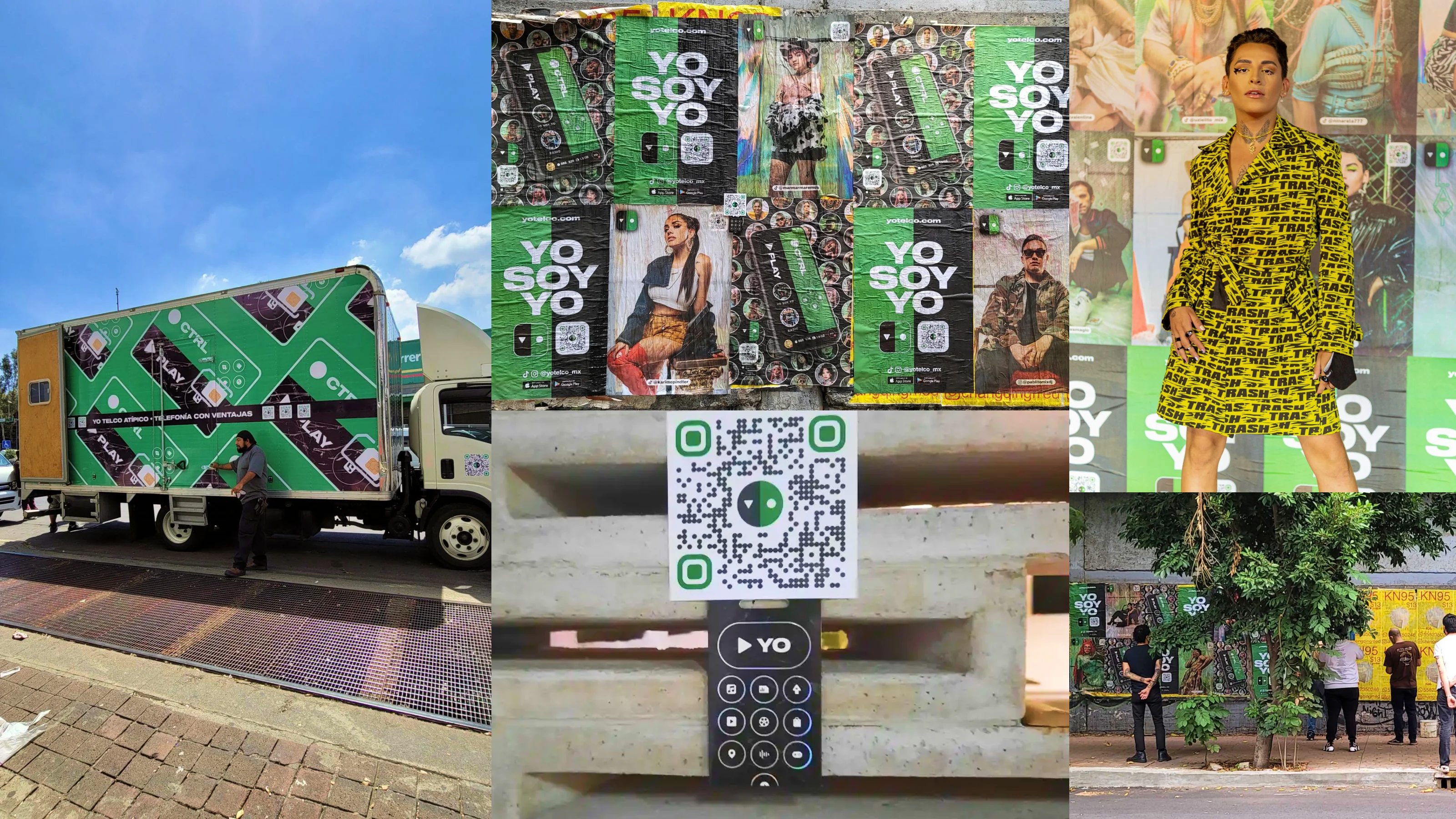
The YO brand extended well beyond the app. Branded truck wraps, wheat paste posters, QR-embedded stickers, and influencer content activations brought the PLAY and CTRL identity into the streets of Mexico City. The "YO SOY YO" campaign gave the brand a voice that matched its visual energy: direct, culturally specific, and impossible to confuse with a legacy carrier.
After leaving full-time in 2021, I stayed on as Design Director on a freelance basis, continuing to shape the brand and product as the company expanded into two new business units. The design foundations built during my tenure held up through that growth, and the platform now operates globally across eSIM, MVNO, and licensing verticals.
One product, many front doors
YO was really three products sharing one app: a telecom layer, a media layer, and a rewards layer, each with its own logic, opened by people for completely different reasons. Designing any one of them was manageable. The actual work was making them cohere, so that someone topping up their data and someone joining a watch party still felt like they were in the same place.
It taught me that cross-surface coherence is a design-system problem long before it's a screen problem. If the patterns don't hold their meaning as context shifts, every new surface quietly reopens decisions you thought were settled. When the shared language is solid, adding a surface extends it. When it isn't, you end up rebuilding.
Let's work together

Mobile App • Broadcast Media
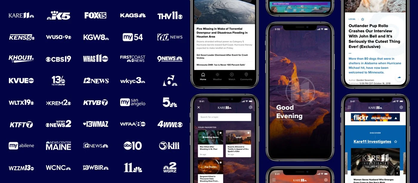
One design system. 62 local news stations. 51 American markets.
TEGNA's mobile apps were a patchwork: outdated, inconsistent, and disconnected from the broadcast brands their audiences already trusted. The challenge wasn't just to redesign an app. It was to build a system flexible enough to express 68 distinct local identities while feeling like a single, coherent product family.
Local news, national scale. No shared design language.
TEGNA is one of America's largest broadcast companies: 62 stations covering markets from Sacramento to Washington DC, delivering local news to millions of Americans daily. But their mobile apps told a different story: each station had effectively been left to manage its own product, resulting in a fragmented family that shared a codebase but little else.
The digital team came to Code and Theory with a mandate: transform local news into a highly social, personalized, and visually unified mobile experience across 62 stations, 51 markets, and audiences who didn't think of themselves as TEGNA viewers at all. They thought of themselves as KARE11 viewers. Or WUSA9 viewers. That distinction was the whole design problem.
Designing for variation as a first-class requirement
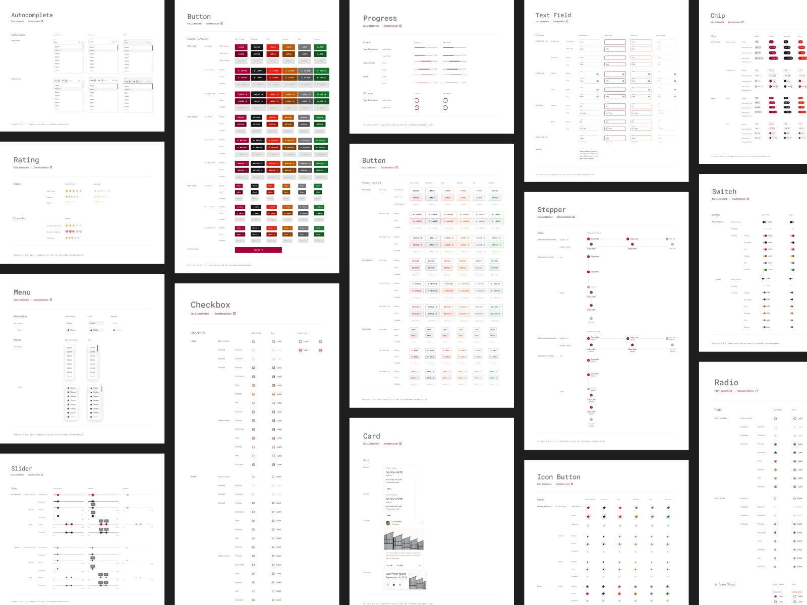
The core design challenge was a real creative tension: how do you build one system that makes every station feel local? Our answer was a tightly opinionated component library: same color palette, same typography, same product features across all 62 stations. The system was intentionally locked down. Consistency at that scale only works if you resist the urge to customize everything.
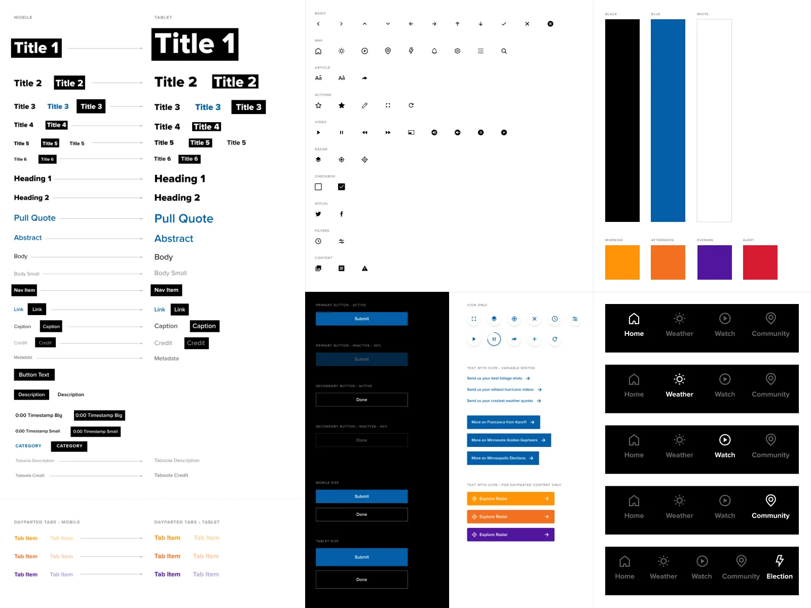
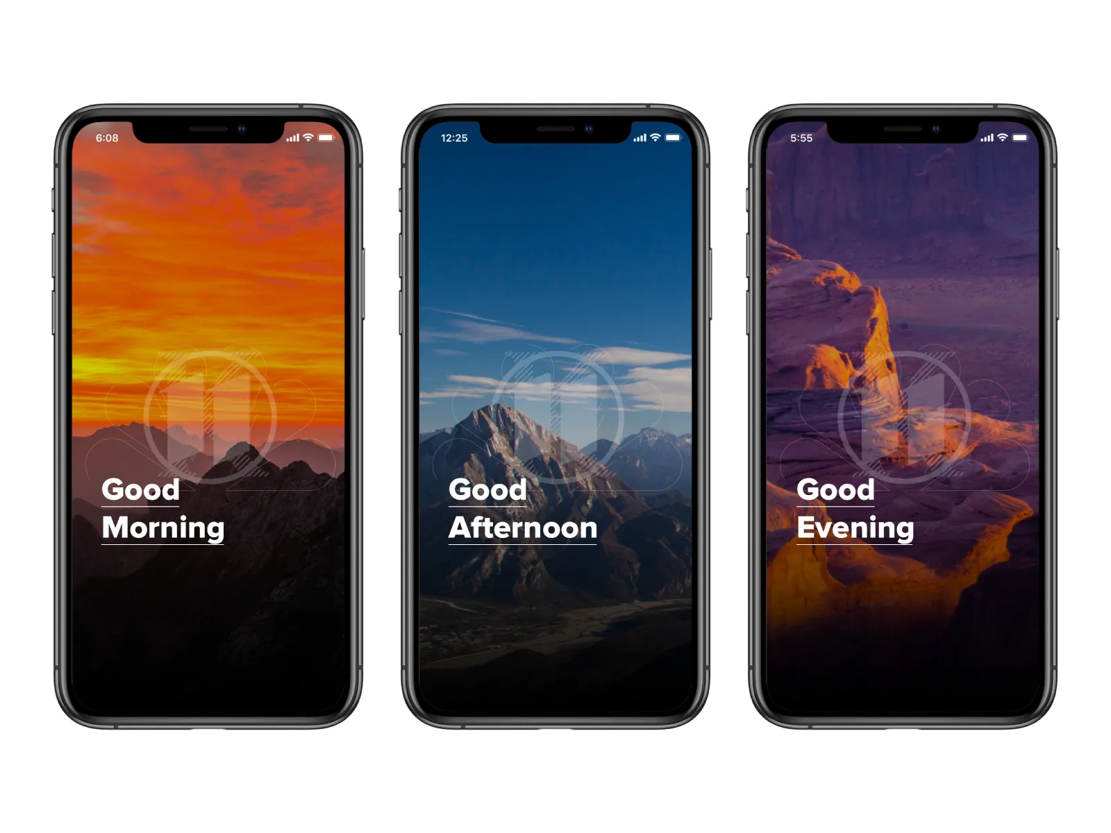
Each station controlled exactly two variables: their logo and a set of dayparted landscape photography tied to their local region. That was enough. Swapping those two elements transformed the same underlying product into something that felt distinctly local, without fragmenting the system or multiplying the maintenance burden.
"We weren't designing apps. We were designing the infrastructure for 62 local design teams who didn't know they had one."
Rebuilding the product surface around video, personalization, and community
The redesign wasn't just a visual refresh. It introduced meaningful new product functionality. A modular story card system let TEGNA's content teams publish stories at varying levels of editorial importance, with breaking news formats and push notification integration baked in. The challenge was building enough flexibility into the card architecture that a breaking weather event and a human interest piece could share the same component without either feeling like a compromise.
The picture-in-picture video player let users watch a story's hero video while scrolling the full article, relatively novel in news apps at the time. Keeping the video in frame while reading the full story removed a friction point that had previously forced users to choose between watching and reading.
The community map introduced user-generated content for the first time, letting locals contribute photos, videos, and social posts to their station's feed. It gave each station's app a live, participatory layer that no national news product could replicate.
The topic navigator gave users meaningful control over their home feed: a first step toward real personalization at scale. Rather than a single algorithmically ranked stream, users could surface content by beat, topic, or interest area, making the app useful even on days with no breaking news.
The TEGNA apps launched in fall 2019 and set a new bar for local news mobile experiences in the US. Searching "TEGNA" in the Play Store today returns a family of apps rated 4.5 stars and above, years after the redesign shipped.
One system that still lets each place feel like itself
On paper it was a consolidation project: 62 local news apps into one. The harder and more interesting question was what not to consolidate. Strip out everything that made a TEGNA station feel like the one a viewer grew up with, and you get consistency at the cost of the familiarity people actually showed up for. So we kept the spine shared (structure, navigation, components) and left deliberate room for each station's local identity inside it.
If I did it again, I'd define that boundary earlier and more explicitly. The things worth standardizing are usually the ones that lower cost and risk; the things worth protecting are the ones that carry meaning to the people using the product. Telling them apart is most of the work.
Let's work together
Web • Global Ecommerce
Modernizing LG's global web design system for a company operating in 100+ countries
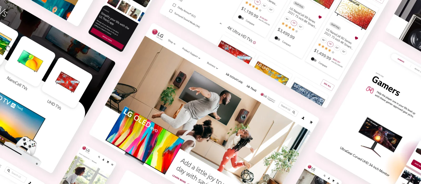
When COVID caused home electronics sales to skyrocket overnight, LG.com wasn't ready. Years of incremental decisions had left the site technically functional but visually inconsistent and impossible to scale. I was brought in as Lead UI Designer to fix the foundation.
A global website serving 100+ markets. No shared design foundation.
LG's in-house team knew exactly what they needed. What they lacked was dedicated bandwidth to build it. In collaboration with MISC Design, we embedded directly with LG's design and engineering teams: not to deliver a finished product, but to build scaffolding they could own and extend independently. The challenge wasn't designing components. It was designing a system legible enough for a team of dozens to use without us in the room.
Building on Material UI rather than from scratch
A key early decision was to adopt Material Design as the technical foundation rather than build from scratch. LG's in-house team was already fluent in it, it offered solid accessibility handling out of the box, and it gave us a shared vocabulary with engineering from day one. For a team that had been baking text directly into promotional images for years, moving to a shared technical foundation with engineering was the prerequisite for building anything that could behave properly at scale.
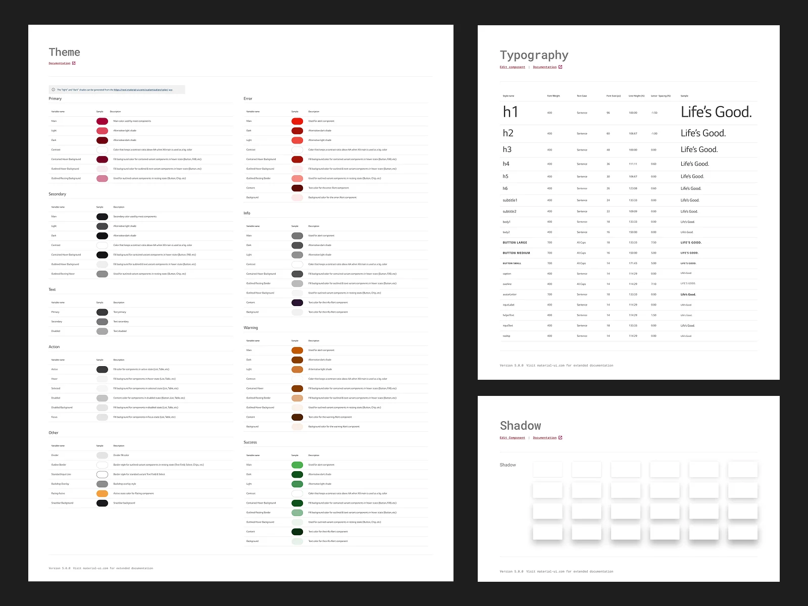
We built a comprehensive token library: color, typography, and shadow, documented with clear naming conventions and usage guidance. Every token decision was made with the LG marketing team's day-to-day workflow in mind. The system needed to be approachable enough that a non-designer could publish a compliant banner without guessing at spacing values or reaching for the wrong red.
Giving LG's teams the ability to build without asking for help
Alongside the component library, we designed a flexible content module system built on top of the Material UI base. Marketing wasn't the only team that needed this. Product teams needed the same thing: a kit of pre-approved, on-brand modules that could be assembled into new pages or used to update existing ones, without a designer redrawing every layout from scratch.
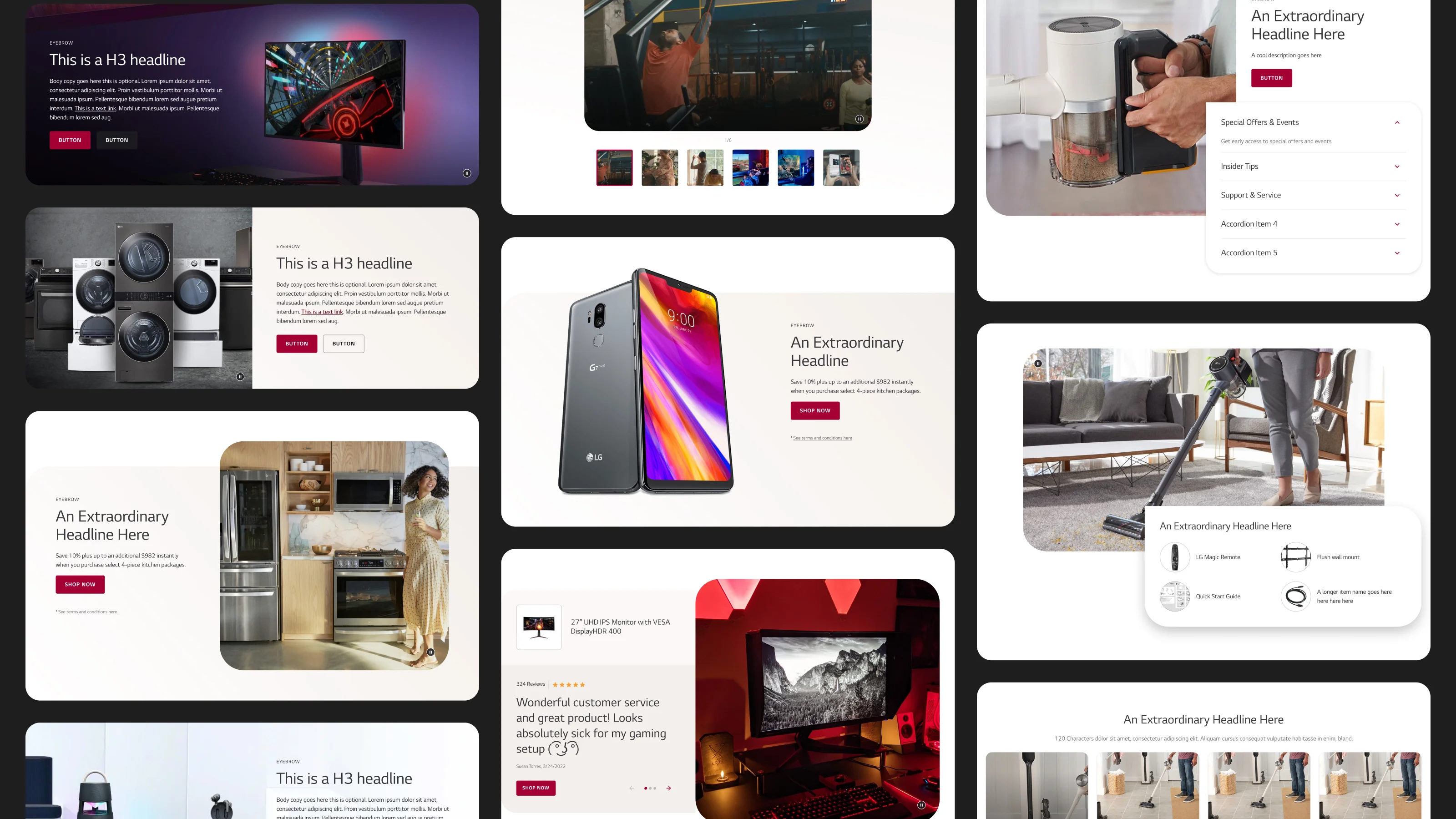
Each module was designed to work independently and in combination: hero banners, feature spotlights, product showcases, review carousels, accordions, and editorial inserts. The constraint was that any combination of modules had to produce a page that looked intentional, not assembled. That meant defining clear layout rules, consistent spacing logic, and content guidelines for each module type so the system did the design work even when a designer wasn't in the room.
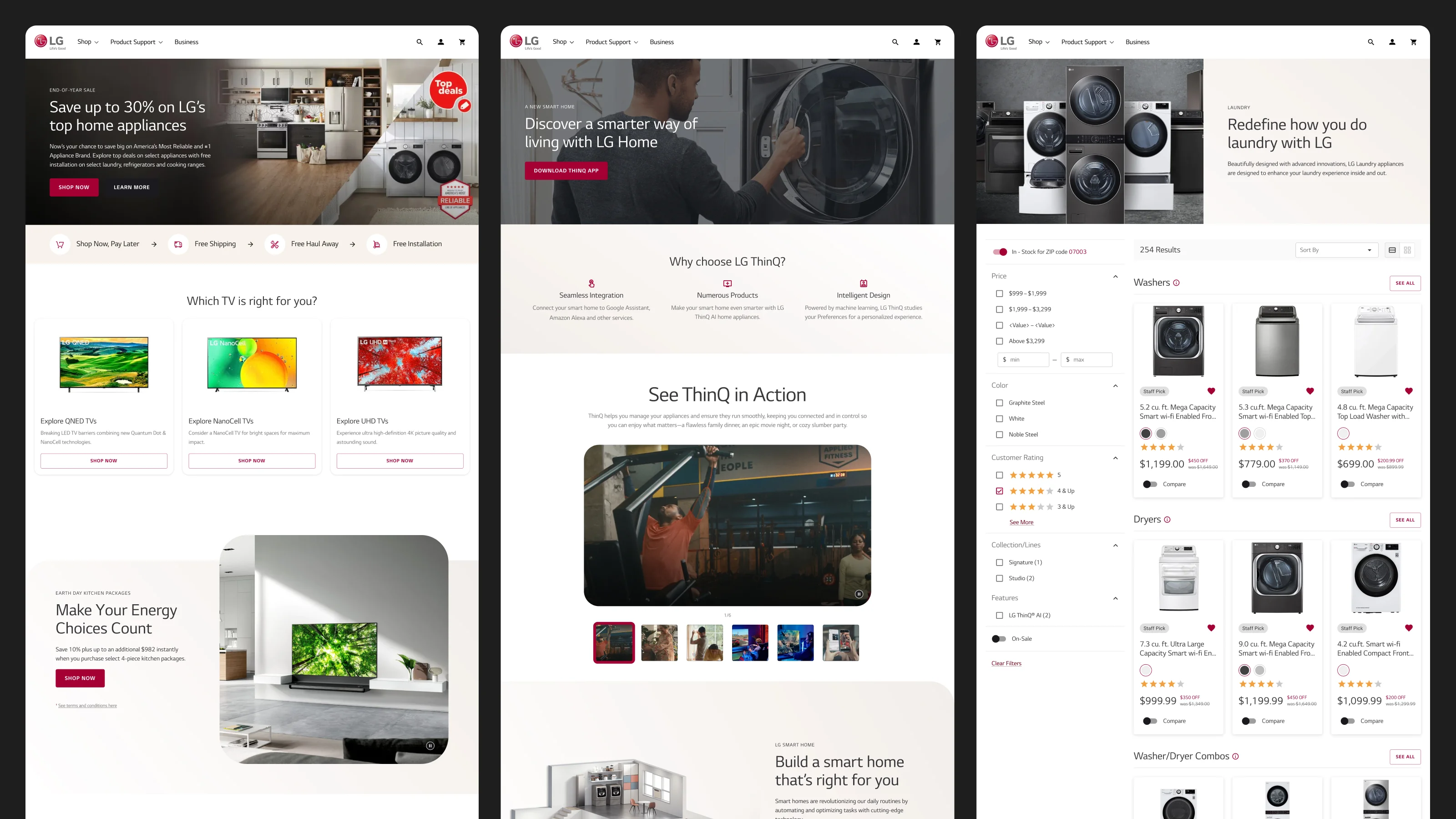
The same modules show up across very different page types: the homepage, campaign landing pages, and product detail pages, each with its own pacing and priorities, but all built from the same underlying kit. Two smaller decisions ended up mattering more than expected. LG's palette at the time was almost entirely white, light gray, and red: clean, but cold. I pushed for a light beige as a page and module background color, which gave the system warmth without breaking the existing brand. I also pushed for rounded corners across cards and modules, softening what had been a fairly sterile, sharp-edged look. Both choices were small on paper. Both are still visible across lg.com today.
Designing for a team that would own this long after we were gone
The success metric for this engagement wasn't whether we shipped beautiful components. It was whether the in-house team could confidently extend the system without us in the room. That shaped every decision: naming conventions chosen for clarity over cleverness, documentation written for the new hire not the current team, component APIs designed for flexibility over rigidity.
"A design system you can't hand off isn't a system. It's a dependency."
We ran working sessions with LG's design and engineering teams throughout the engagement, not to review deliverables, but to transfer knowledge and get real buy-in on every architectural decision.
LG completed a global rebrand in 2023. The token foundations, component architecture, and small but lasting decisions like the shift to warmer beige tones and rounded corners all carried through into that transition. A system only gets rebuilt when it's worth building on.
Changing the system is easier than changing the habit
The most underestimated challenge was legacy behavior. Years of baked-in text on promo images had created workarounds that the team had built muscle memory around. Designing a better system is only half the job. The other half is making the new way of working feel easier than the old one, fast enough that people don't revert.
Let's work together
Web • Editorial
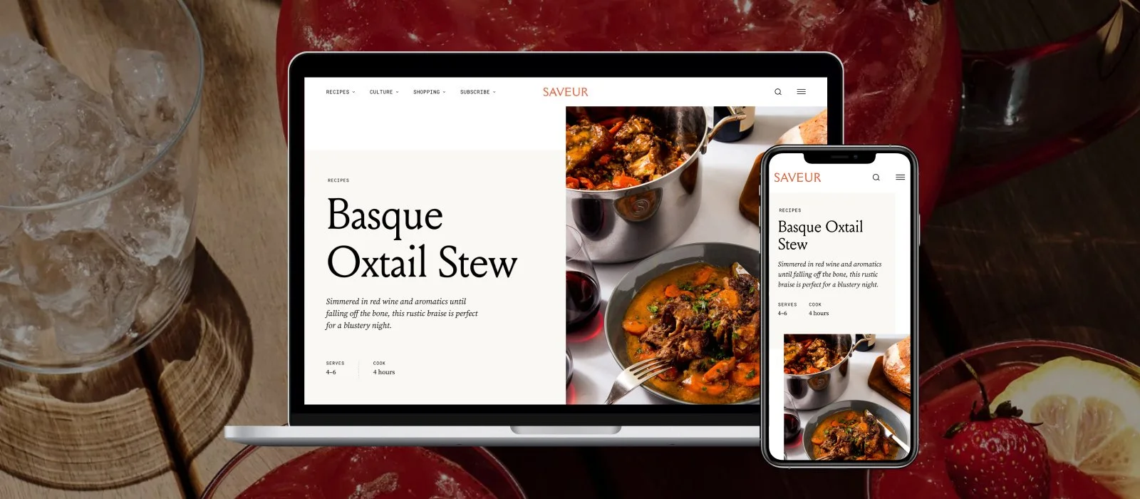
Giving Saveur a digital presence worthy of its 30-year print legacy
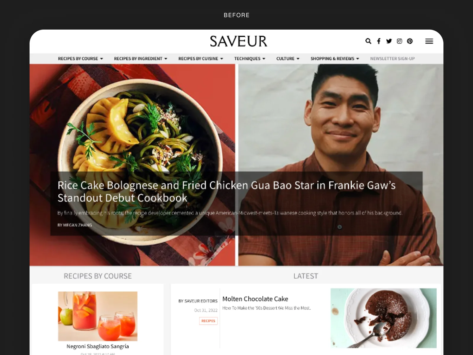
Saveur has been one of America's most respected food and beverage publications since 1994. By 2022, their website didn't come close to reflecting it. A boilerplate WordPress theme was doing the work of expressing 30 years of rich, opinionated food culture. I was brought in to fix that.
A publication with decades of visual authority. A website that didn't know it.
Saveur's print heritage is legitimately extraordinary. Lush travel photography, deep culinary storytelling, recipes that read like literature. The magazine earned a devoted following by treating food as culture, not just content. The digital product had none of that conviction.
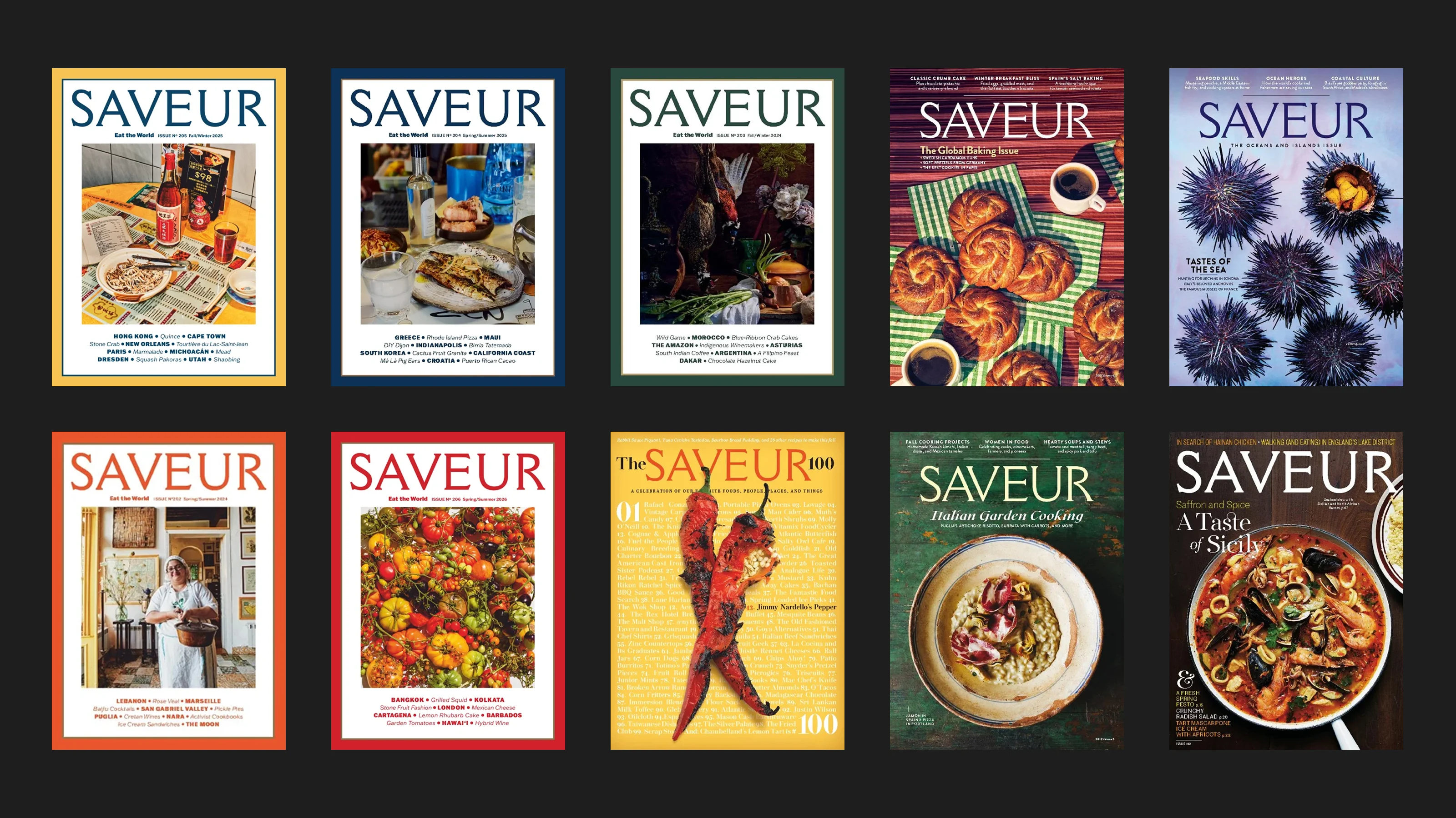
I was brought in as a solo design engagement over two months, working directly with Saveur's Creative Director and Brand Design Director to define a new visual language suitable for screens instead of print: one that would honor Saveur's print DNA and enhance the reader experience. The engagement culminated in a full responsive layout system and Figma design system, handed off directly to Saveur's web development team.
Every visual decision made in service of the content
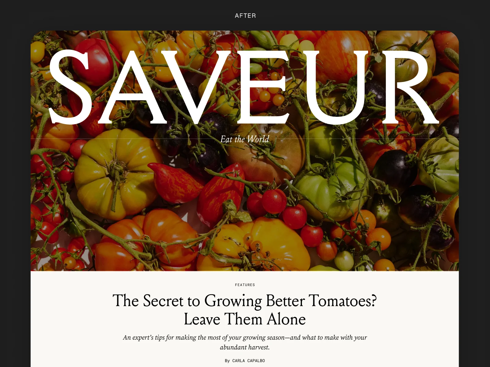
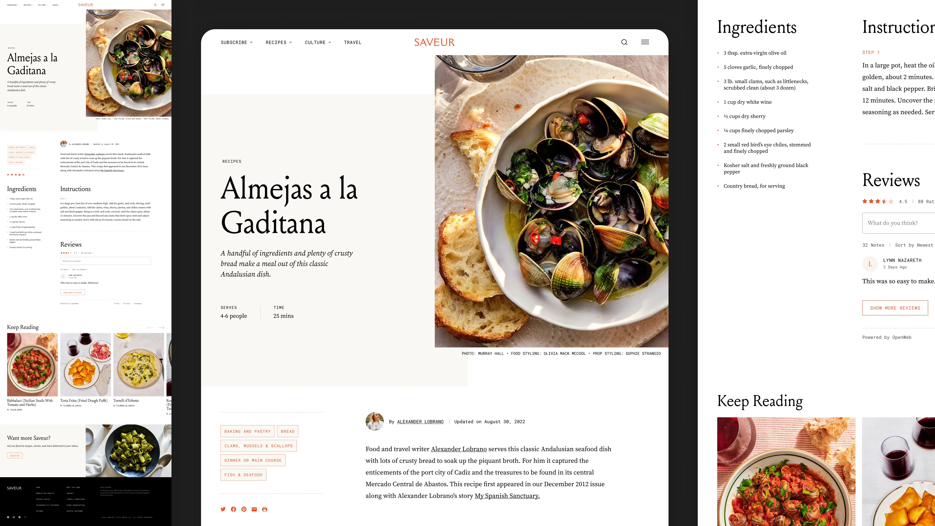
The homepage hero opens with an oversized Saveur logotype at full bleed, a direct reference to the masthead of their printed magazine covers. The gesture is intentional: it signals immediately that this is a publication with a point of view, not a content aggregator.
Layout structure was used as an editorial tool. Rather than the uniform card grids of their previous WordPress template, the redesign alternates between symmetrical and asymmetrical content arrangements, mixing image sizes and column weights throughout the page. The variety does real work: it reflects the way a magazine editor lays out a spread, giving different weight to different stories and creating a visual rhythm that rewards scrolling.
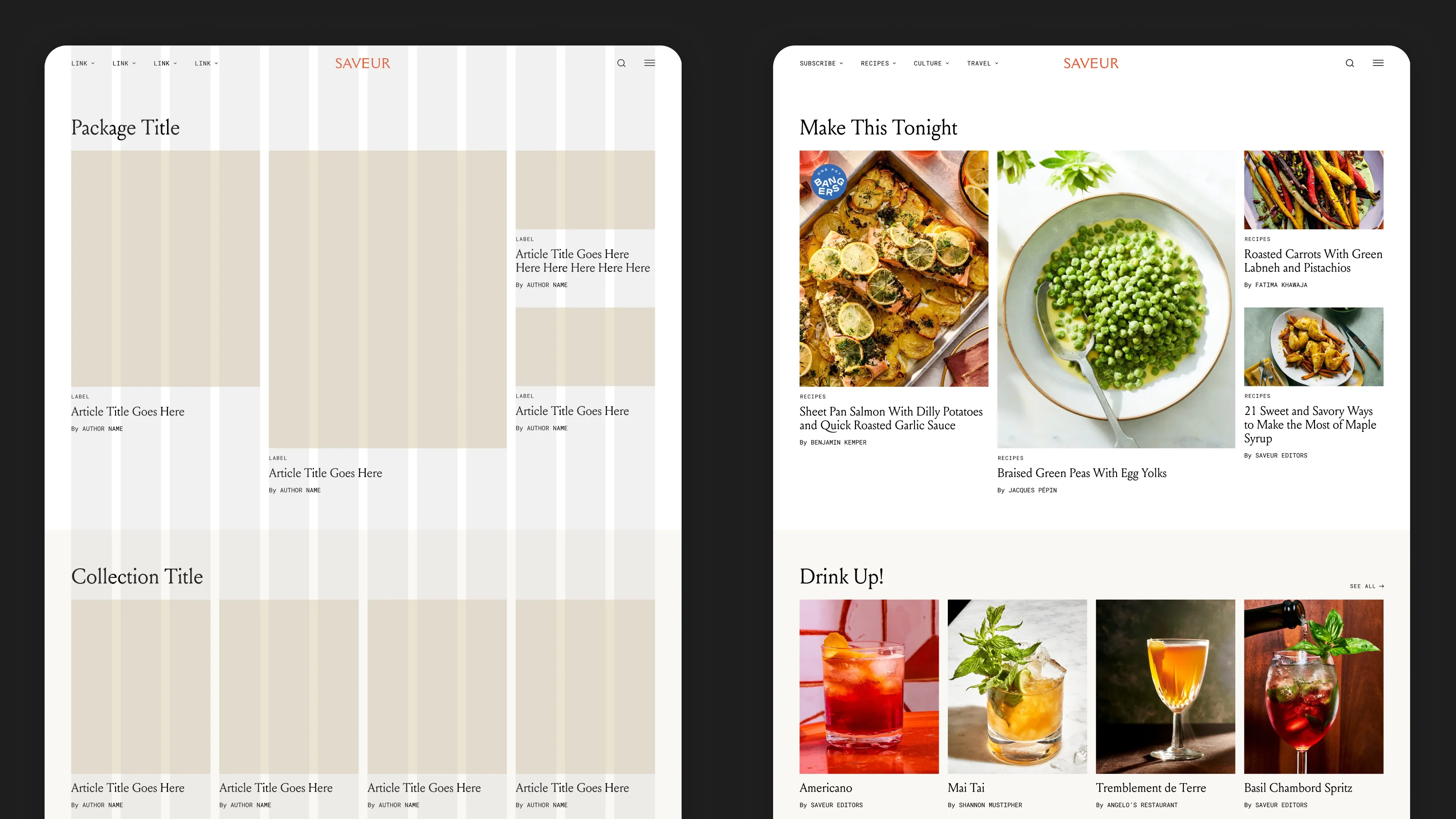
Color was kept deliberately minimal: black, white, and warm beige form the base of the entire system, creating a neutral canvas that lets Saveur's photography do the talking. The single accent color, Saveur orange, is reserved exclusively for interactive and branded elements: links, tags, buttons, hover states. Nothing competes with the food.
"Print gave us the vocabulary. We just had to translate it: masthead to hero, editorial grid to layout rhythm, hierarchy to scroll."
Rebuilding IA around how food lovers actually browse
The old site organized content the way a CMS organizes content: by category and date. Saveur's readers don't browse that way. They follow cuisines, they look for travel contexts, they search for a specific ingredient. The redesign introduced a topic-first navigation model: surfacing content by cuisine, course, ingredient, and technique, with a cross-linked system that lets readers enter the catalog from multiple directions.
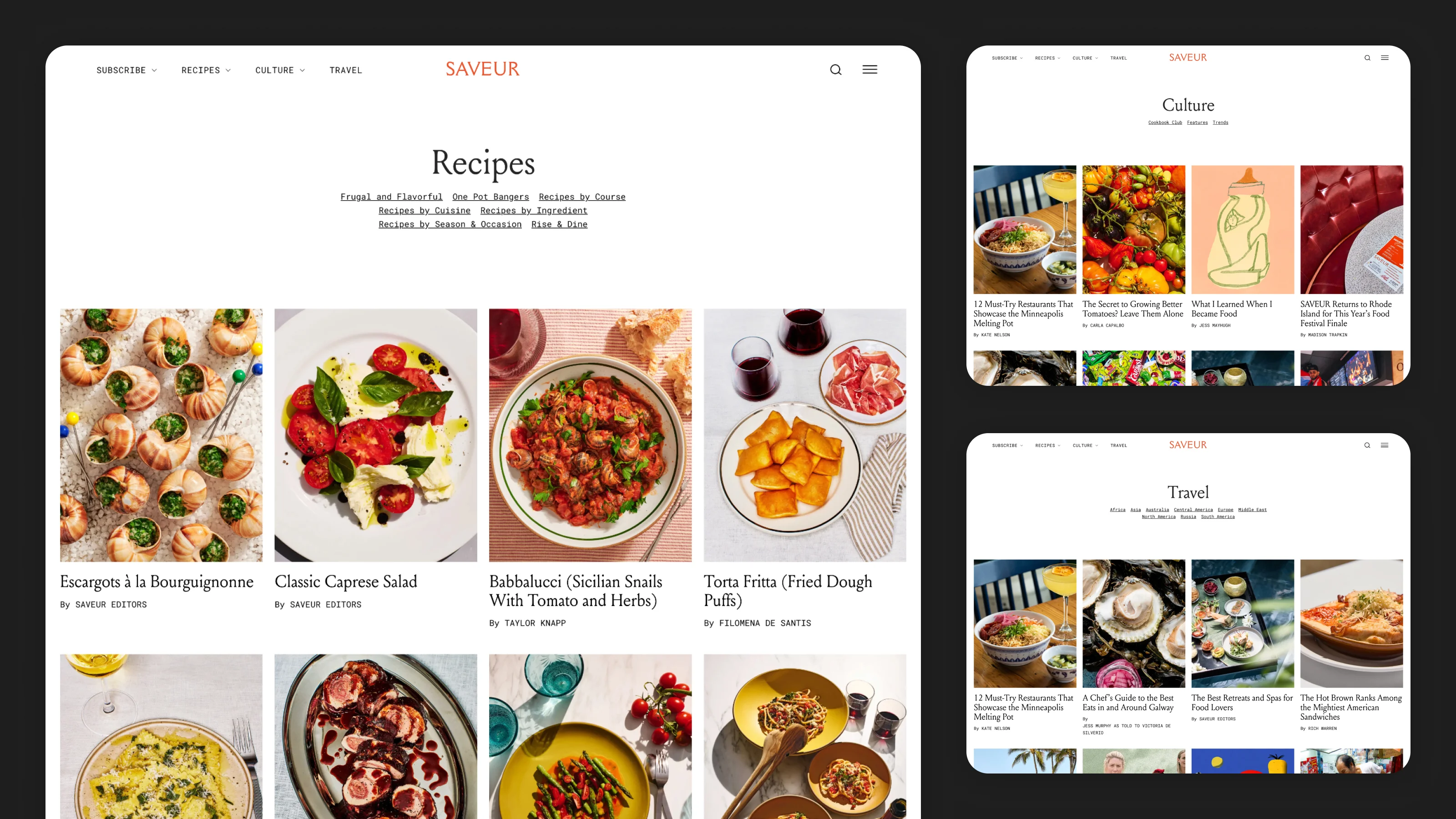
The homepage is built on a flexible content module system that gives Saveur's editorial team direct control over what readers see first. Rather than a single rigid layout, editors can select from a range of curated content packages, hero features, editorial grids, trending roundups, shop picks, and arrange them in any order. Each module has its own layout logic, creating natural visual variety as you scroll: wide cinematic leads give way to tighter multi-story grids, which open back up into full-bleed photography. The result is a homepage that reads like an edited magazine spread, not an algorithmic feed.
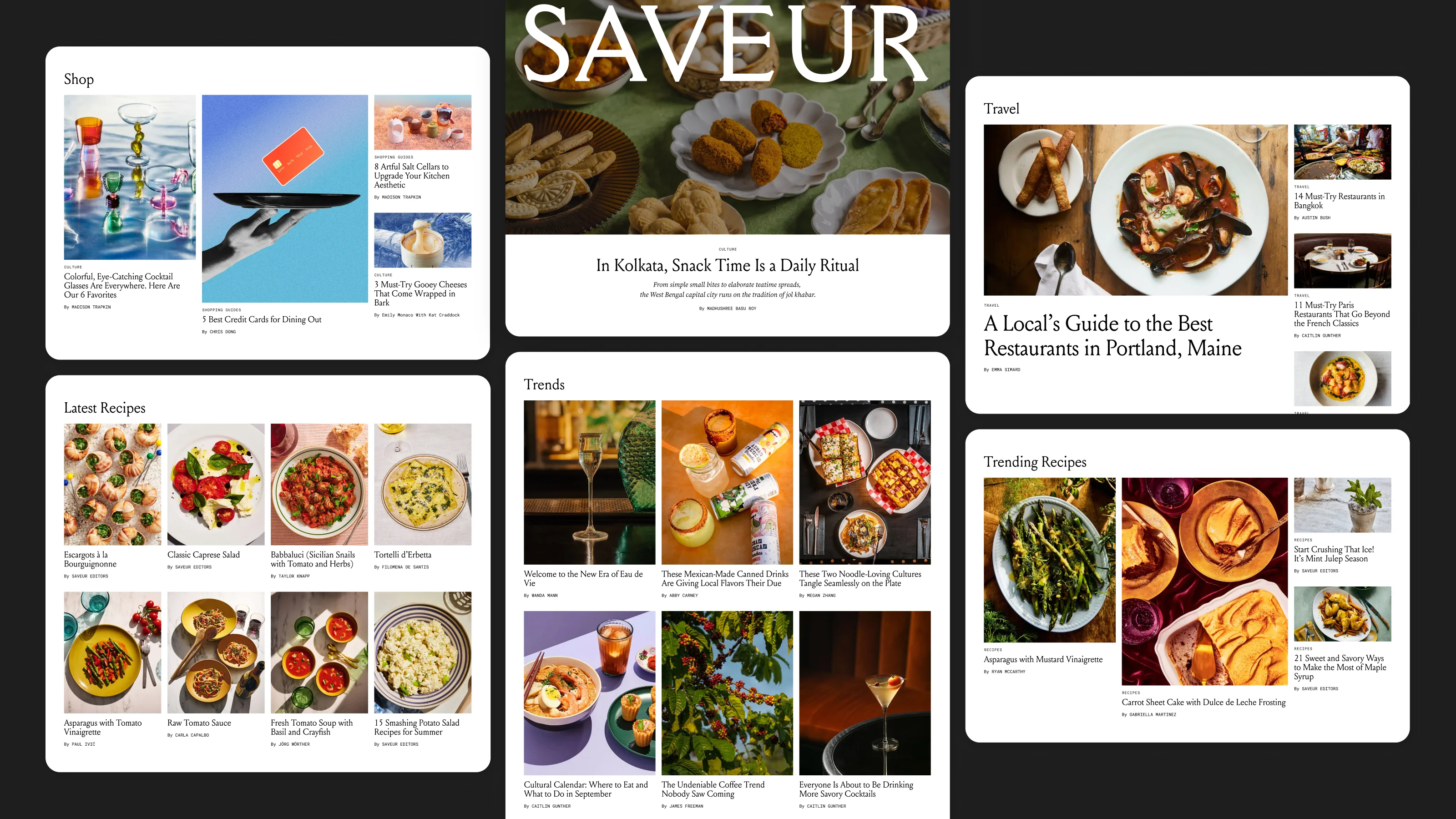
Article pages are designed to keep readers inside Saveur's world long after the recipe ends. Every recipe is attributed to a linked author, letting readers who discover a writer they love immediately explore their full catalog. A persistent tag system on each page, organized by ingredient, course, cuisine, and technique, turns casual browsing into deeper discovery. At the bottom of every article, a recirculation module surfaces related recipes based on shared tags, offering a natural next step. And there is no page end: as a reader reaches the bottom, the next relevant story loads automatically, creating an uninterrupted reading experience that removes the friction of active navigation entirely.
"This was an award-winning website redesign that directly resulted in a $500k brand partnership program."Brand Design Director, Saveur
The redesign gave Saveur a digital presence that finally matched the publication's editorial ambition. Four years after delivery, the design remains live and largely unchanged: a sign that the system was built with enough flexibility to evolve with the content, not against it.
Curation and the feed are not opposites
Saveur's discovery model was deliberately editorial: curated packages, hand-weighted layouts, and recirculation by shared tags rather than a single ranked stream. For a brand with a real point of view, that was the right call, and it held up for four years.
What I'd define earlier next time is the handoff point: where editorial curation should start giving way to personalization as the catalog and audience grow. That's the real discovery question. Not whether to use editors or algorithms, but which decisions each one should own.
Let's work together

Hello, I'm Annie. I've spent the past 13 years building consumer entertainment experiences from the ground up.
Background
I started in NYC creative agencies before moving into startups full-time. What I found was that the skills agencies drill into you: taste, craft, speed, working across disciplines, translate directly into what startups need most. I've since led design on a mobile carrier app, an online casino, a national news platform, and a 30-year-old editorial brand. Each one taught me something different about how design earns trust with an audience.
I've been the first designer in the room at multiple startups, the sole designer on products used by millions, and the system architect behind products that scaled without breaking. I work at the intersection of brand and product because the best consumer experiences are inseparable from both.
How I work
The brief is a hypothesis, not a mandate. I approach every project with a question: Is this actually the problem worth solving? The answer is rarely a straight up "yes" and more often "not quite" or "it depends". Defining the problem and the scope properly is equally as important as the work itself.
Systems thinking is crucial from day one. Every decision at the component level is made with the pattern in mind, and every pattern is made with the system in mind. This matters for organizations of all sizes, and especially for startups, where haphazard shortcuts taken in month one can compound painfully by year two.
The best experiences should feel inevitable. I design for the person who just wants it to work: No lengthy instructions, no friction. Simple, intuitive, and considered all the way to the edges. If it feels effortless, it's working.
Experience
Founder & Principal Designer
Today Studio · Remote
Co-Founder & Principal Designer
Betty · Remote
Head of Design
YO Mobile · New York, NY
Senior Visual Designer
Code and Theory · New York, NY
Visual Designer
Code and Theory · New York, NY
Junior Visual Designer
Code and Theory · New York, NY
Multidisciplinary Designer
Madwell · Brooklyn, NY
Junior Visual Designer
F# · New York, NY